This concept was showcased on Behance as a featured project. (Formerly webdesignserved.com)
Nokia
Responsive Website Concept
Client
Nokia
Role
UX Design
UI Design
Concept/Case Study
Period
2013
Overview
Rethinking the old ways
Once again, I found myself with a touch of boredom and decided to take on the task of revamping the existing Nokia website. I held the belief that Nokia could greatly benefit from a contemporary and streamlined online presence.
Naturally, the redesign is responsive – a crucial requirement in today’s web landscape. Enclosed are a series of mockups showcasing the main page and a product page (Lumia 920) displayed on various devices. It’s worth noting that this conceptual redesign is by no means affiliated with the official Nokia team; it’s a personal creative exploration.
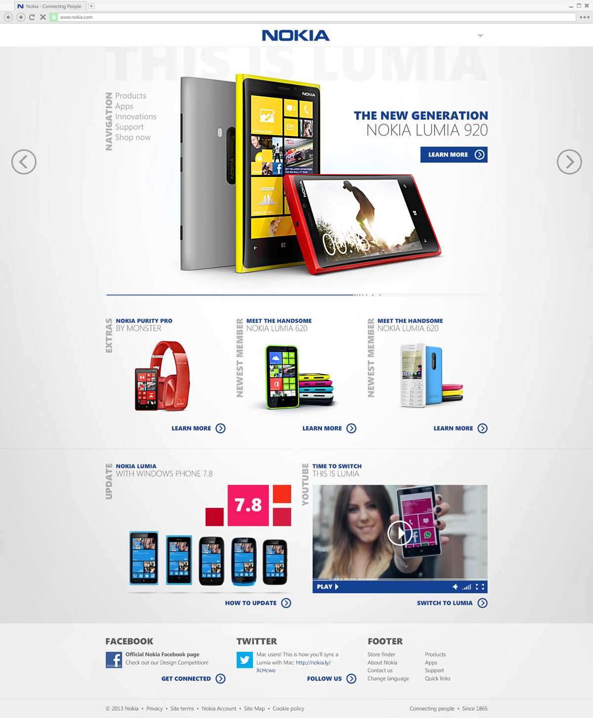
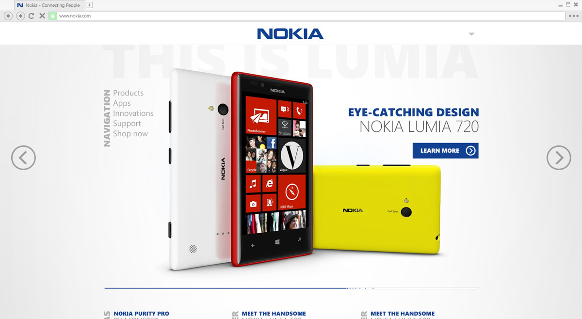
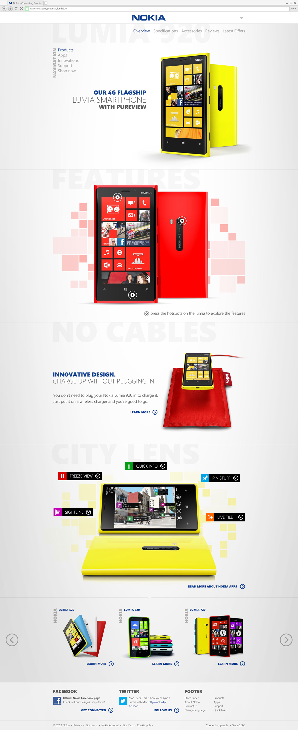
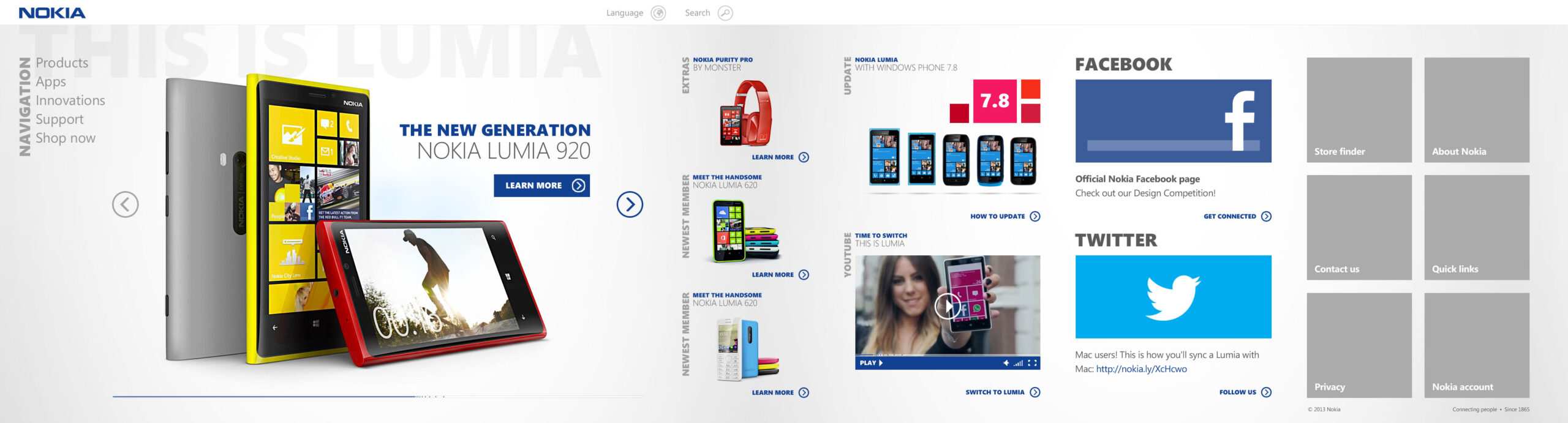
Main Page
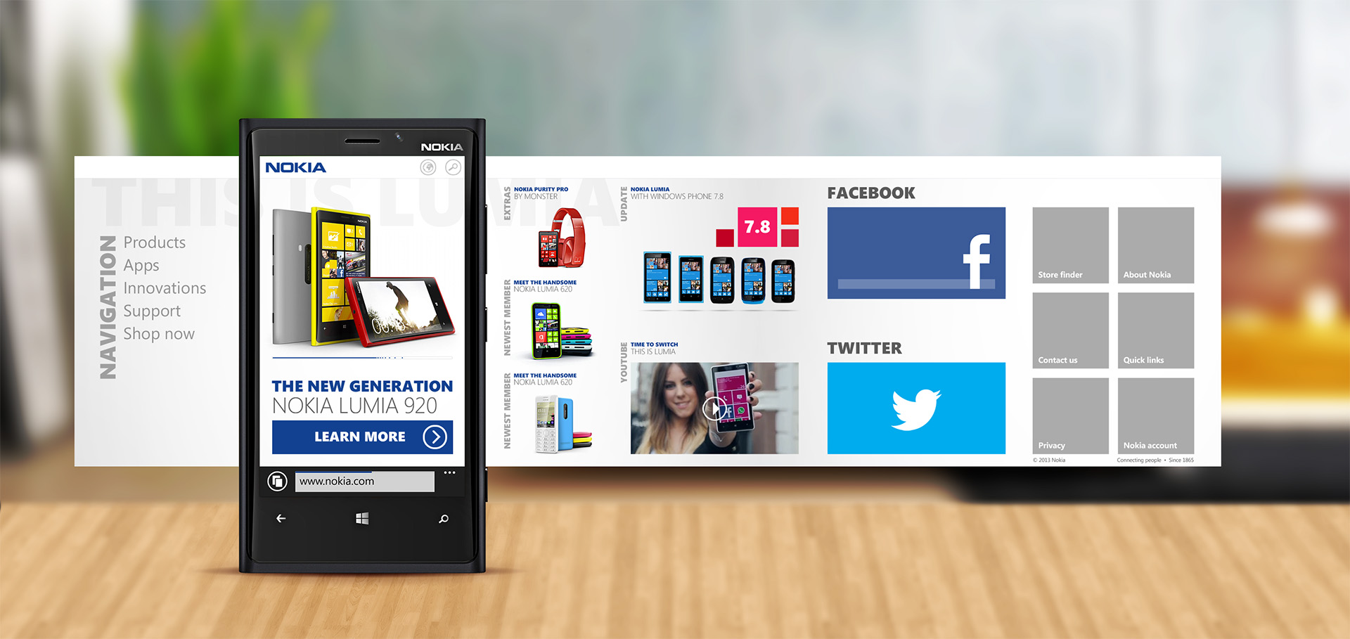
Here’s where your journey begins on the page. The design is minimalistic, featuring ample whitespace. The header is compact, housing a dropdown menu for language selection and search options. Similarly, the primary navigation menu resides on the left side. At the page’s summit, a prominent slider showcases new products, resembling the loading bar familiar from Windows Phone interfaces.
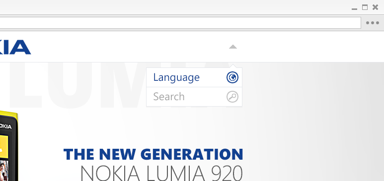
Dropdown
Dropdown menu close-up. Here you can select the language and search the website.
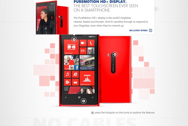
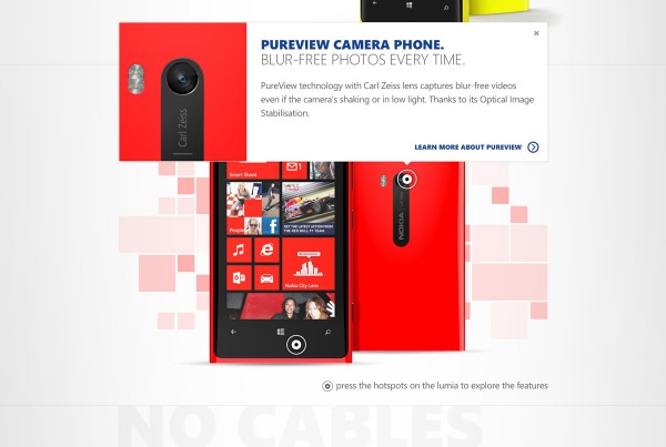
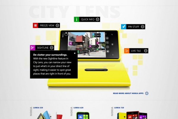
Product page
At the pinnacle of the product page rests the chosen device. Within the features section, you have the option to click on the “hotspots” to delve deeper into the details of each feature.
The hotspot feature offers a magnified view of crucial characteristics, accompanied by informative tooltips for the primary features of the HERE apps.
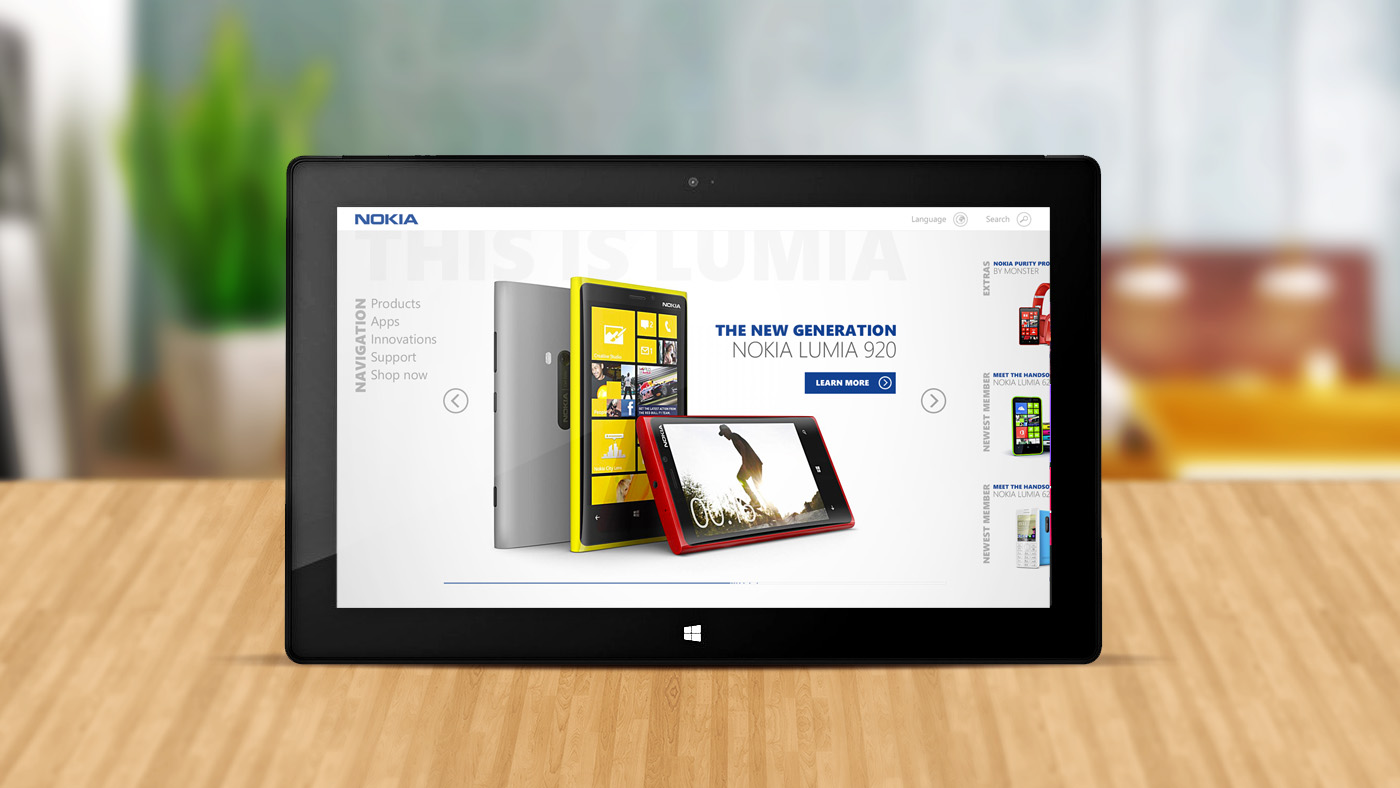
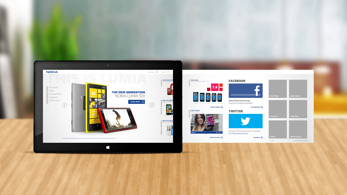
Tablet View
On tablets, the navigation takes a horizontal orientation, reminiscent of the Windows Metro style. To navigate, simply swipe the content left or right.
Mobile View
The mobile site mirrors the distinctive navigation style commonly found in Windows Phones.