The previous Skype concept I made a few years ago.
Skype
Re-redesign 2016

App Name
Skype – Desktop
Role
UX Design
UI Design
Concept/Case Study
Period
2016
Platform
Universal Windows App
Overview
The neverending Skype concepts
It’s been slightly over two years since I shared my Skype concept. With a few spare hours this week, I decided to revisit the redesign and infuse it with a fresh 2016 aesthetic. Additionally, I held a strong curiosity about how my design preferences have evolved, and I was eager to explore the changes I would make this time around.
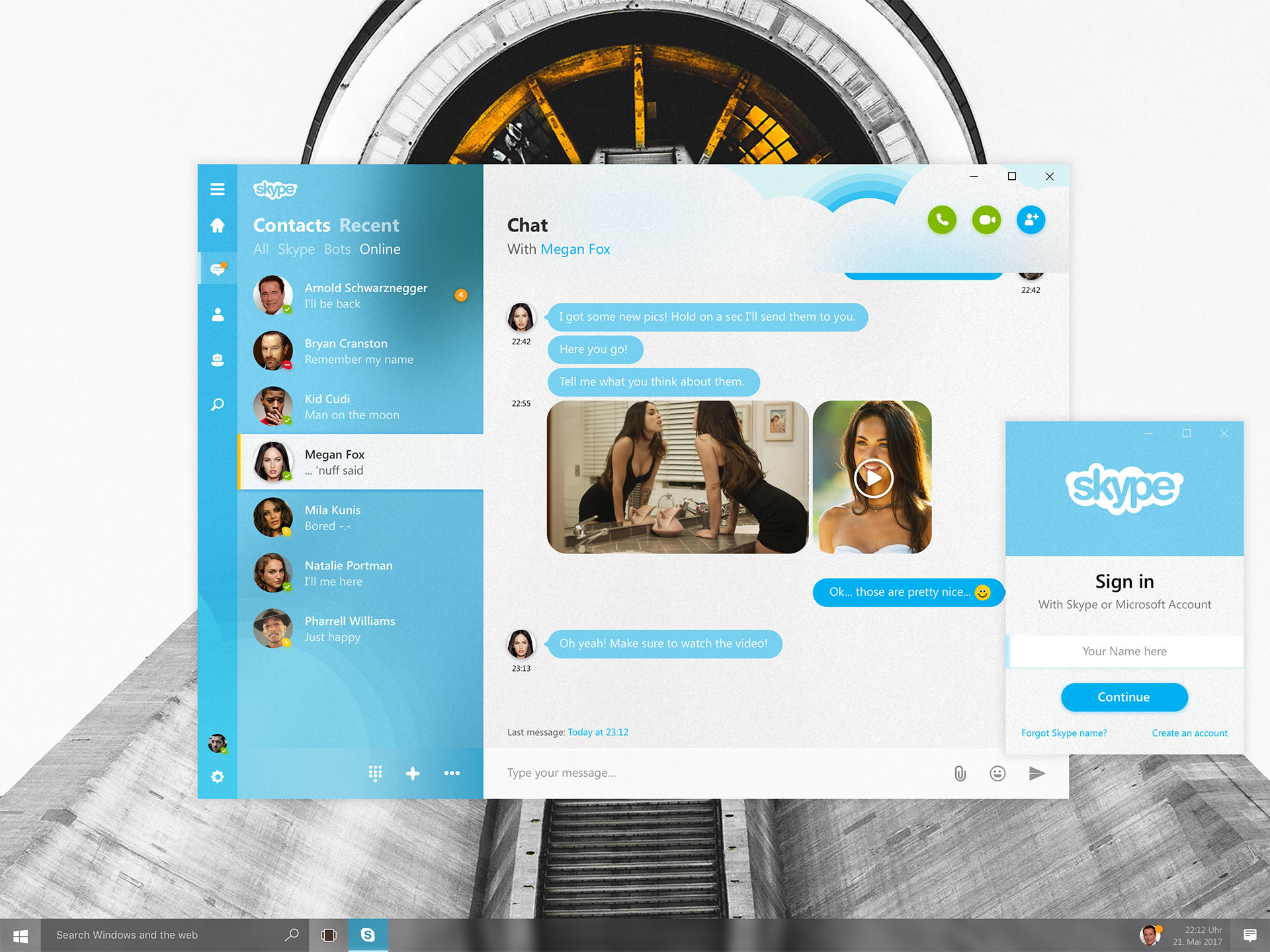
While I have a genuine fondness for Skype, I believe that the app, particularly on Windows, has yet to reach its maximum potential and seize the chance to truly distinguish itself in the bustling messaging arena. The recent design updates are undoubtedly appealing, yet they still retain a rather subdued and pale color palette. To address this, I developed a version featuring vibrant hues, reduced clutter, improved contrast, and an overall revitalized and contemporary appearance.
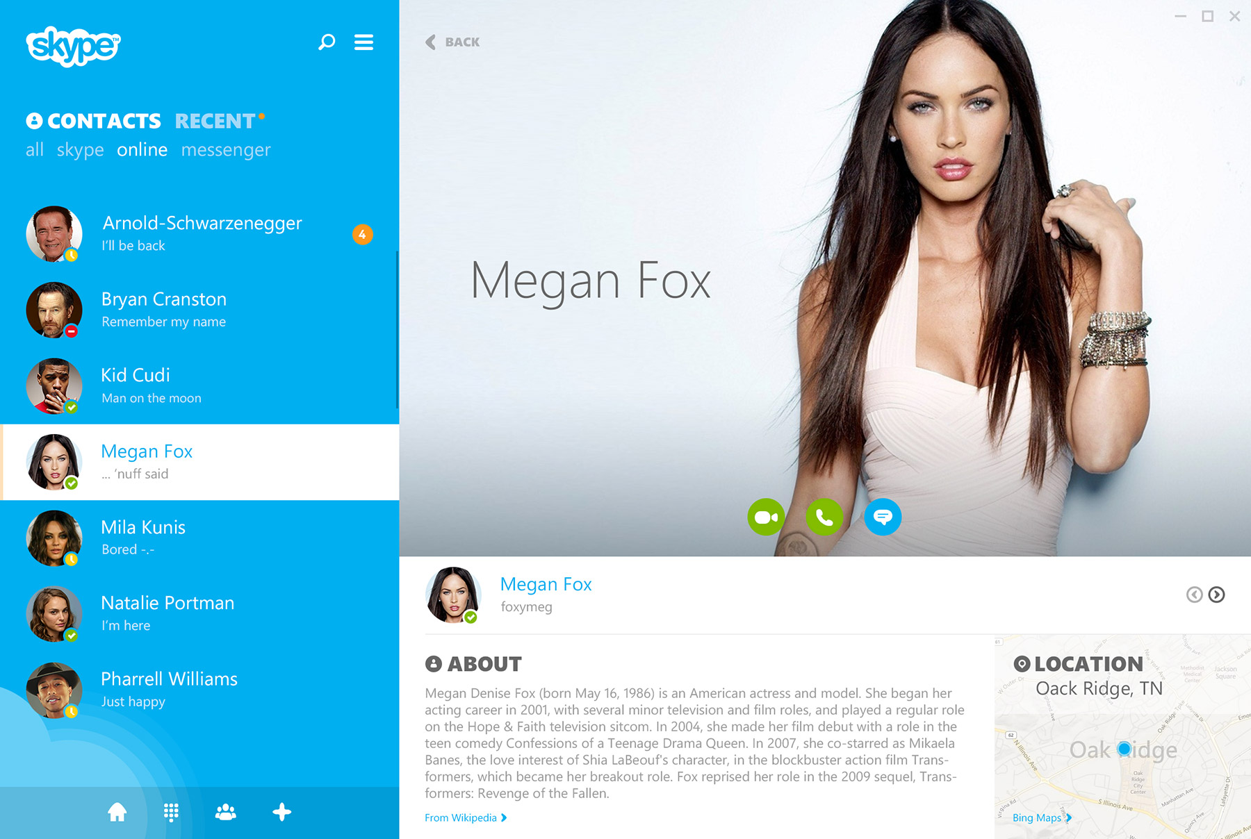
Profile screen
I made some adjustments to the profile screens, enhancing their visual appeal by introducing increased contrast. Additionally, I organized and streamlined the information presented for the selected user.


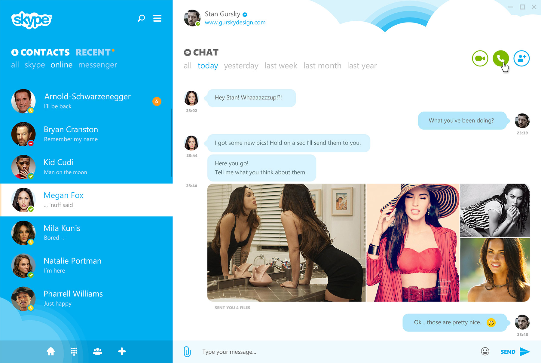
Chat screen
The chat screen has undergone a cleanup process, featuring improved formatting for inline content and enhanced visualization of chat bubbles. Moreover, the message compose bar has been refined, now incorporating an additional attachments button.
Videocall & dialpad
In its windowed state, the Videocall feature encompasses a fullpane view that can seamlessly transition to a fullscreen display. Within the interface, you’ll find several options beneath it: the ability to add new users, record calls, or include a task or appointment. Upon activating the chat function, the videocall elements shift to the top of the pane, revealing the familiar chat interface.


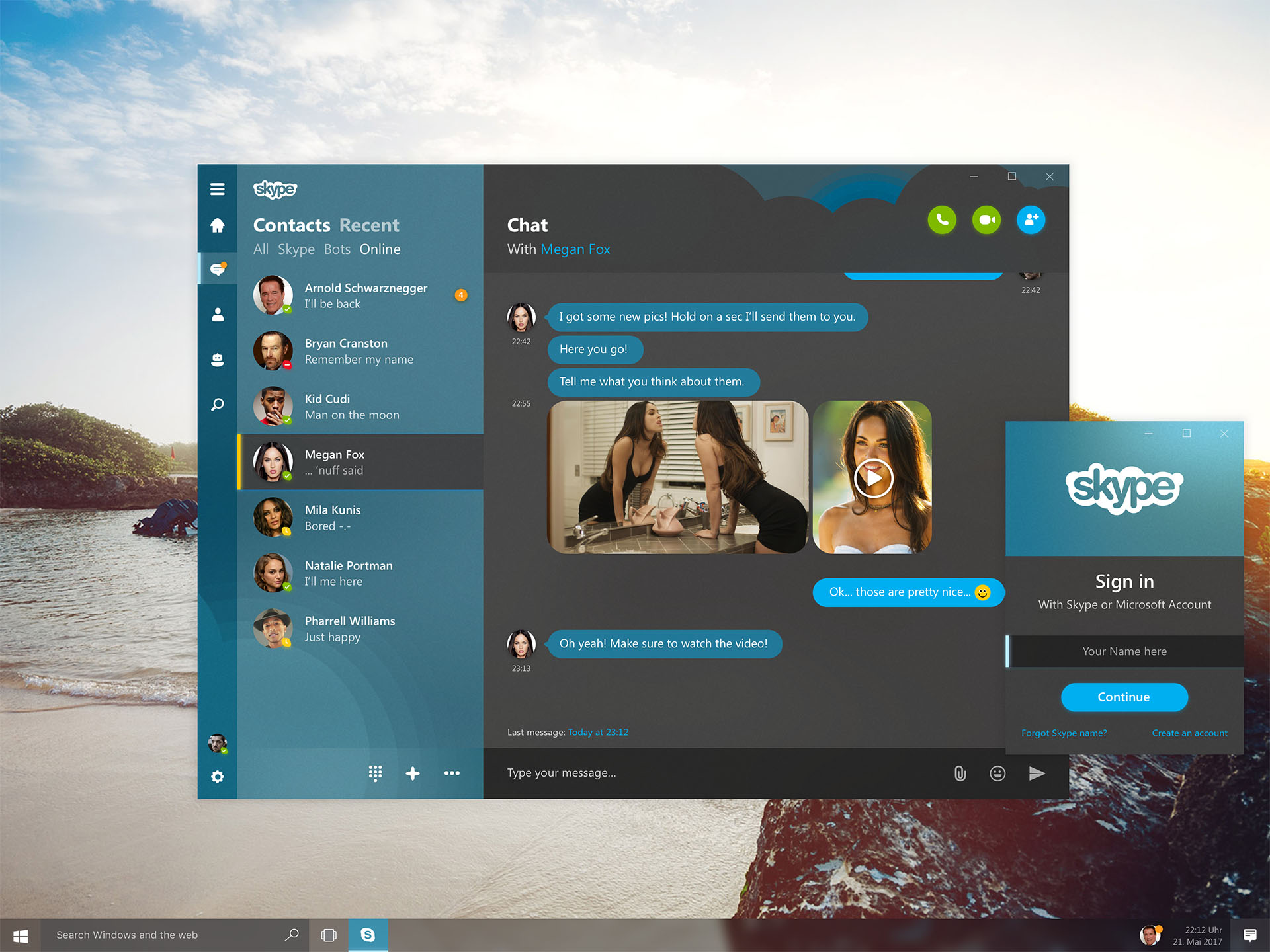
Light & Dark Mode
In a time before the introduction of Dark Mode, when Light Mode was the prevalent choice for user interfaces, I took it upon myself to explore and gauge the appearance and user experience of specific elements and the overall interface. My aim was to gain insights into how these elements interacted and how the interface as a whole looked and felt under these circumstances.