Evolving
I finally found some time to refresh my own stuff such as business cards, invoices and just the whole overall look a bit.
I started with logo and went through almost everything there was. To have every piece match I simplified and streamlined the Gursky Design look. No more dropshadows and gradients in the logo. No funky bubbles in the background. No minified version of me as a mascot. Just bold colors, fonts and forms.
Logo refresh
This was first thing that needed to be tackled. Looking back at the older logo there were a few issues. First and foremost is the kerning, especially in “design”. The letters were too thin and unproportional. The whole logo felt unfinished.
Since I didn’t want to have any unnecessary elements anymore, I removed the funky bubbles background completely. I also switched the main colors from yellow and orange to reddish and dark grey. The dropshadows and gradients that the logo and a bunch of elements had? Also gone! Boom!
Since the font that I used for “design” only had one weight, I had to redraw the letters and tweak them manually. This way I had way more control over the spacing, weight etc. I straightened out every letter and adjusted also some kinks with the “gursky” typeface.
I think that the final version feels finished now and looks more mature then the previous one. The changes might seem subtle at first but they were definitely long overdue if you’d compare both versions.
Minime/mascot
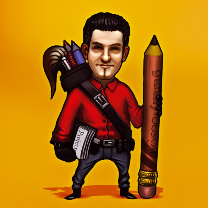
I also decided to remove the minified version of me as an avatar that I mostly used on various social media profiles and on my website. Even though I like the picture a lot, it just doesn’t fit in the overall look anymore. I replaced the avatar with a real picture of me.
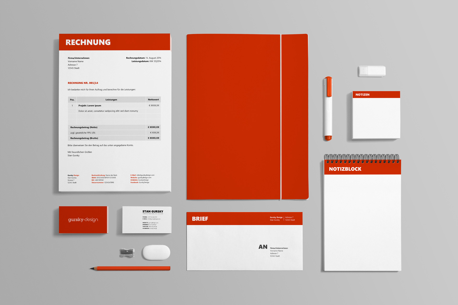
Fresher, flatter, bolder
The whole office equipment is in tune now. Letterhead, envelope, invoice, business card, post-it notes, notebook and the website. Everything matches and follows a design guideline.


