App Name
earworm
earworm
UX Design
UI Design
Interaction Design
Concept/Case Study
2014 – 2015
Universal Windows App
Earworm – the music app that sprang from the ashes of disappointment after Zune’s cancellation and the subsequent underwhelming Xbox music app (which, let’s admit, left much to be desired). Even with Groove providing a mild improvement, the Windows Phone music experience remained visually uninspiring. Regrettably, the earworm project also met its end in cancellation.
Before consigning the entire endeavor to the depths of an archive folder, I deemed it fitting to share its essence. Below, you’ll find a collection of screens and concepts that encapsulate the spirit of earworm.
You see, during the era of Zune (#RIP), I was captivated by what I considered the most aesthetically pleasing music app/player. The hardware highlight was the Zune HD, an alluring device that regrettably remained exclusive to the United States. On the software front, Zune introduced a breath of fresh air, deviating from established design and usability conventions. The ethos was centered around “content is the king.” Instead of overwhelming users with an excess of 3D buttons, countless gradients, and ostentatious embellishments, the interface featured elegantly simple design elements, accompanied predominantly by captivating images relevant to the content at hand.
Particularly during the Windows Phone 7/8 era, the Zune app was an evolution of this vision. When conceiving “earworm,” I was determined to maintain the lively, colorful essence that Zune embodied, while also expanding its scope.
The logo itself boasts a custom font, showcasing a harmonious blend of purple, reddish, blue, and pinkish hues. The overarching design theme leans towards a dark background, adorned with vibrant gradients, where purple takes center stage as the primary color.
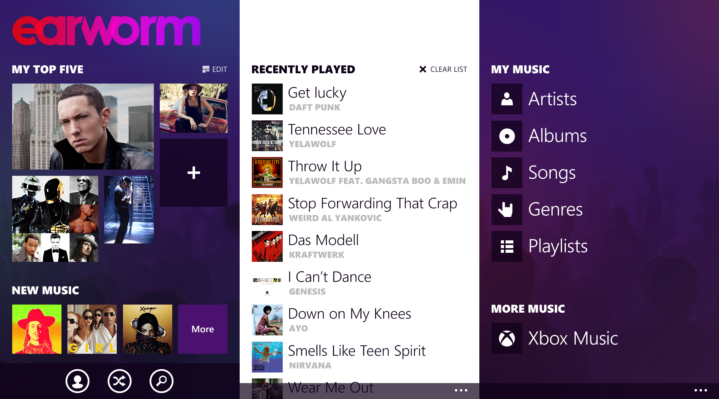
The start screen encompasses a three-sided panorama design. The first pivot serves as the main page, featuring a “My Top Five” section where you can pin your favorite artists, albums, songs, playlists, or genres. If selecting your favorites isn’t your preference, you can let earworm automatically pin them based on your music tastes.
Beneath the favorites section lies the “New Music” strip, which displays the recently added tracks.
The second pivot within the panorama is the “Recently Played” list, showcasing the music you’ve recently listened to. Additionally, there’s an option to clear the list if desired.
The third and final pivot offers a shortcut section for artists, albums, songs, genres, and playlists. It’s worth noting that earworm was intended to be integrated with Xbox Music (now Groove), enabling the purchase and streaming of music from that platform as well.
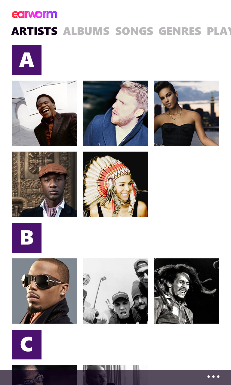
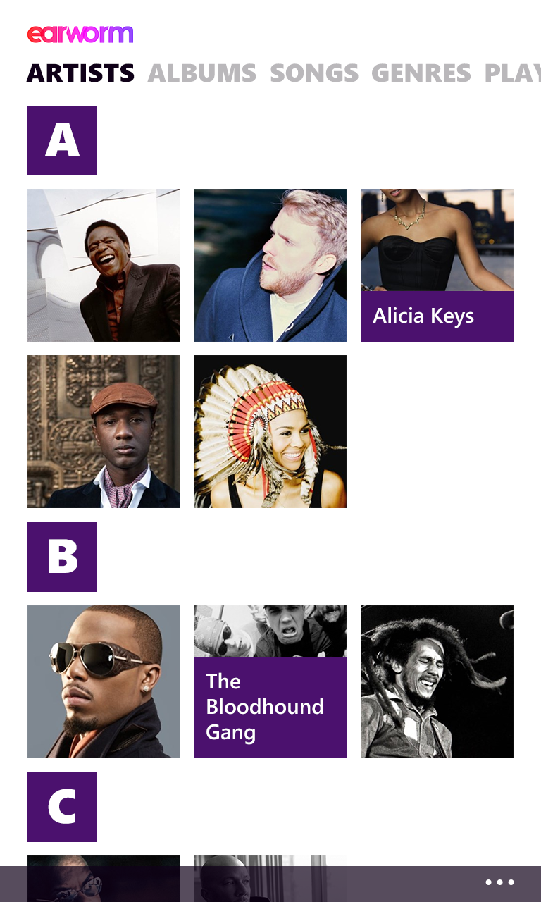
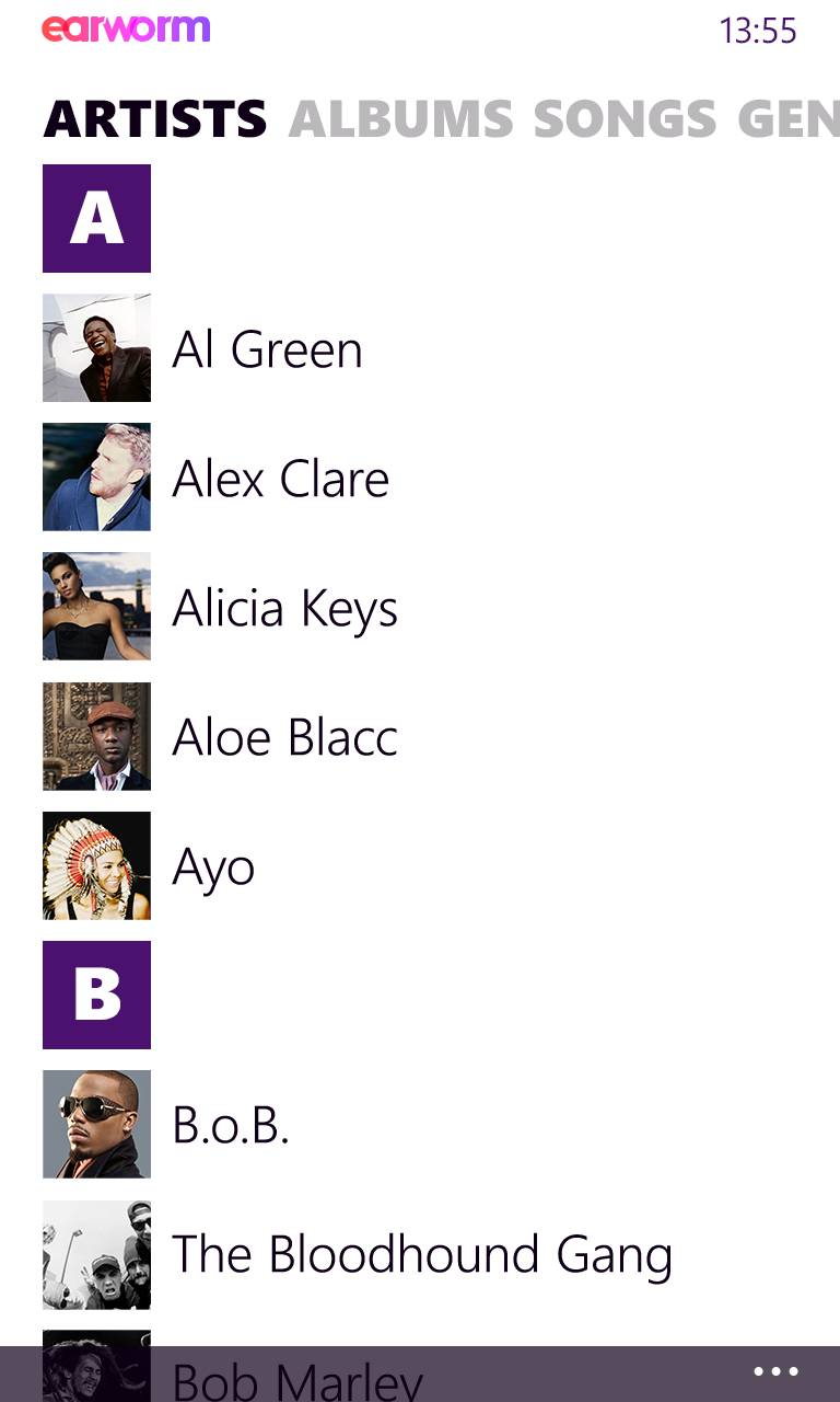
The artist view offers two choices for displaying information.
The initial option involves a grid of tiles, each featuring photos of the artists. These tiles can also exhibit movement or flipping, revealing additional details about the artist.
Alternatively, there’s the standard list view, which presents artist thumbnails alongside their respective names.

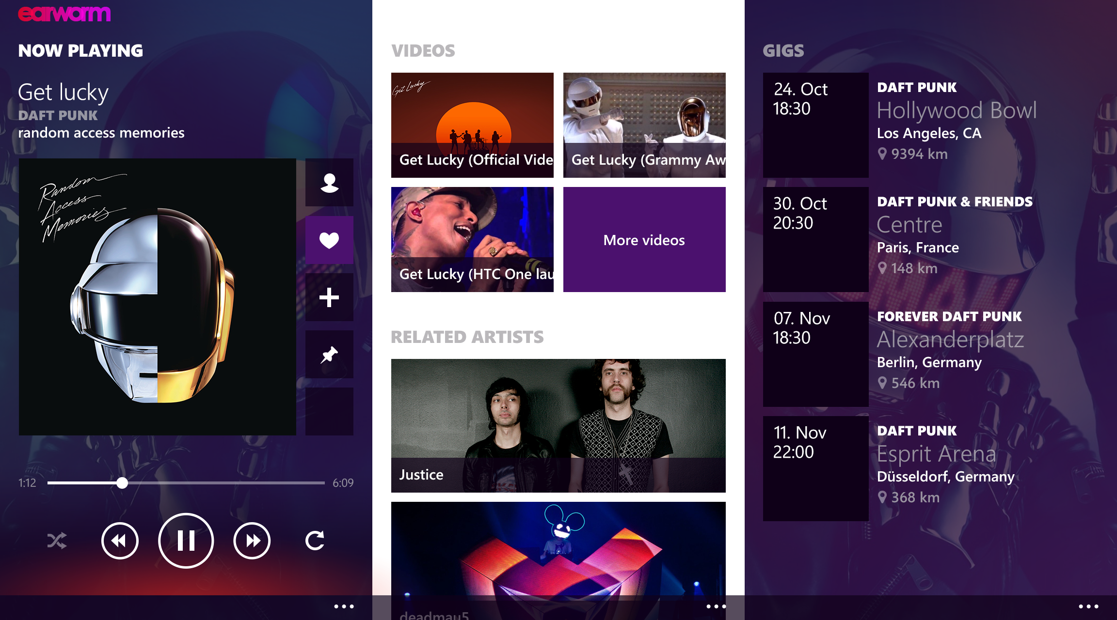
When designing the “now playing” screen, my intention was to create an interface that transcended the usual playback controls. Consequently, this section evolved into a panoramic view supplemented by two additional pivots.
On the main screen, you’ll find all the essential controls and some convenient shortcuts. These include options like reading about the current artist, liking the song, adding it to a playlist, pinning it, or sharing it across various social and music networks. To evoke the Zune ethos, I incorporated a subtle, pulsating gradient at the screen’s base, mimicking an equalizer that moves in sync with the music.
The second pivot holds the music video for the playing song (if available), along with additional videos from the artist. This section also features a segment dedicated to related artists.
The third and final pivot is dedicated to live performances. It provides a display of venues where your selected artist is performing, tailored to your location. Furthermore, the functionality to directly purchase concert tickets via earworm would be seamlessly integrated.
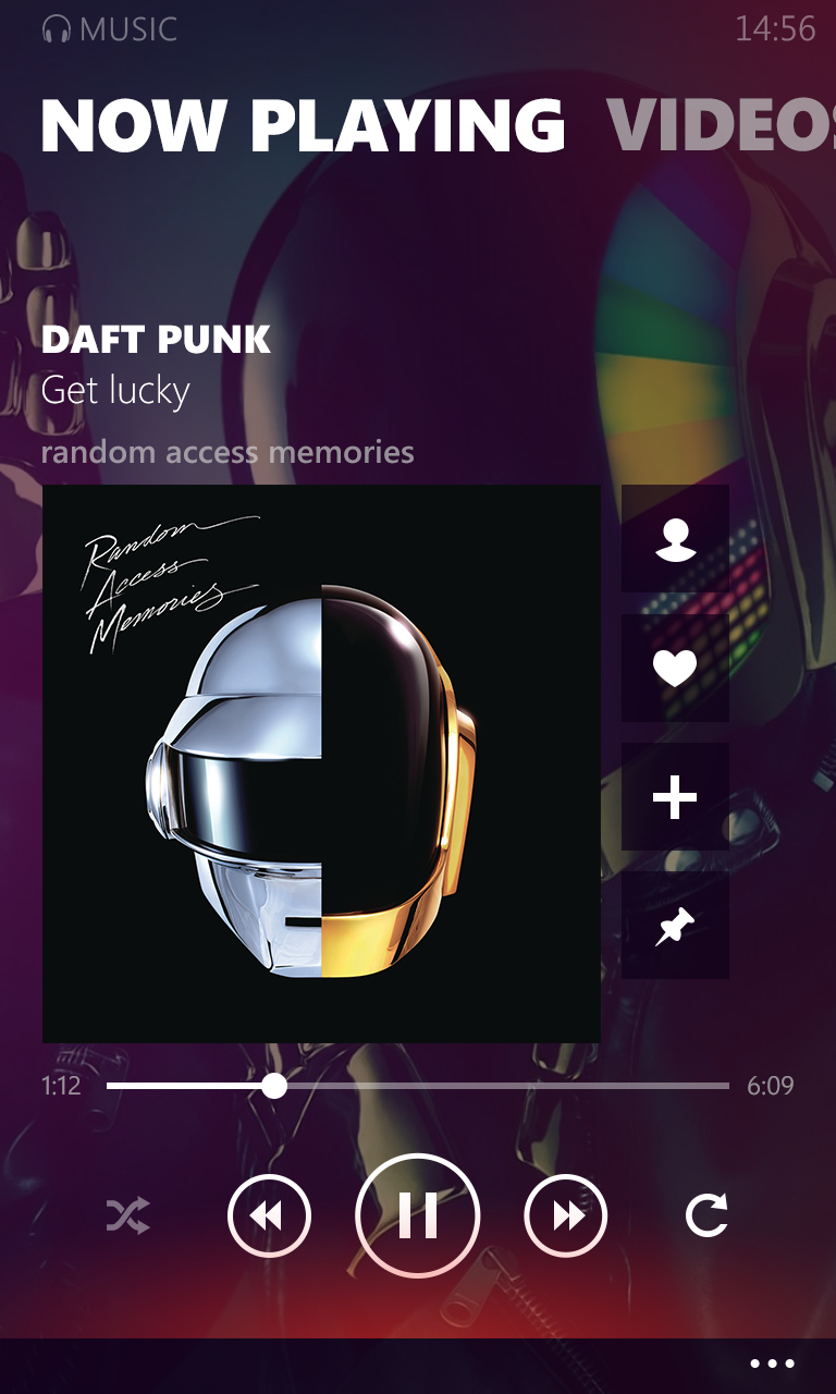
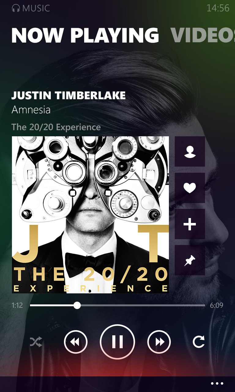
Various visualizations and demonstrations showcase how the screen responds with diverse images and backgrounds. The most straightforward approach was to establish distinct layers. The foundational layer features the primary, universal earworm background, composed of a selection of gradients over a solid purple base. Subsequent to this, the artist’s image is layered at 80% opacity. The third layer involves moving gradients situated above the image yet below the content. These gradients follow randomly generated paths, undergo morphing, and exhibit dynamic movement.
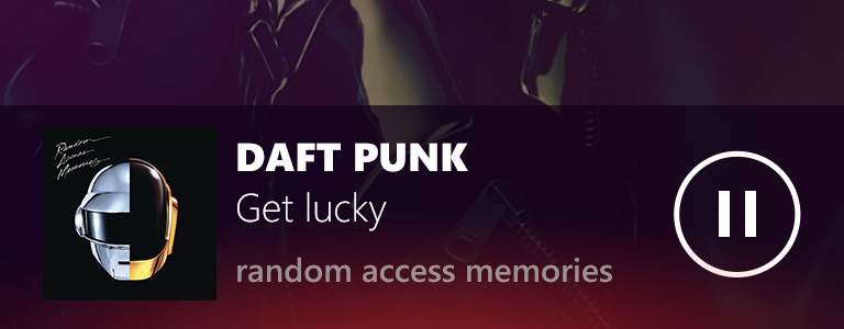
During the initial concept phase, I integrated a miniplayer that would remain fixed at the bottom of the screen while a song was playing. However, upon further consideration, I opted against this approach. Windows Phone offers a convenient feature where pressing a volume button triggers audio controls that emerge from the top of the screen. This functionality rendered the miniplayer somewhat unnecessary. Nonetheless, here’s a glimpse of what the miniplayer design entailed.
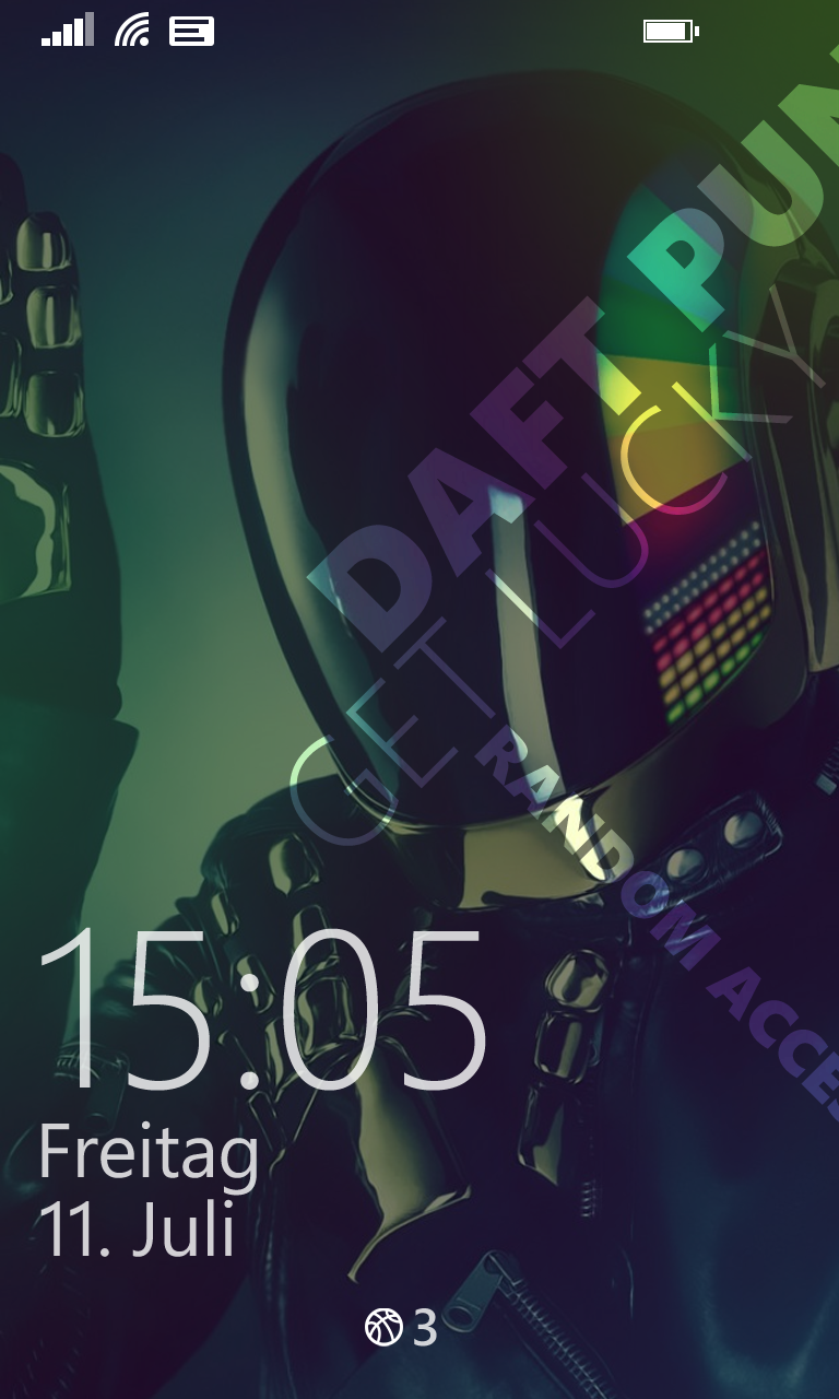
Zune’s visual superiority extended to another noteworthy feature: lockscreen support during the Windows Phone 7/7.5 era, and notably, the screensaver mode in its Windows desktop iteration. The aesthetic appeal was undeniable.
When tasked with implementing something similarly sophisticated yet refined, I created my iteration of the lockscreen support, striving to capture that same charm.
The perfect companion

I must confess that I was eagerly anticipating the arrival of the Microsoft Band, until the disappointing news came that it wouldn’t be launching in Germany with the initial version. Nonetheless, I was curious about the concept of having a small supplementary app on my wrist, while the primary one continued on my phone. This would allow basic functions like music controls and content exploration on the Band.
Interestingly, the Microsoft Band 2 was released a couple of months ago, but it’s still not available in Germany. By the time it reaches our shores, a third version might already be in sight. Unfortunately, this situation makes it impossible to test any apps in real-life scenarios, which makes it unfeasible for me to invest time and money in crafting something for the Band, no matter how exciting it would be. Microsoft, here’s hoping for a change!
