App Name
TckTck – Time Tracker
TckTck – Time Tracker
UX Design
UI Design
Interaction Design
Prototype
Animations
2020
iOS
I’m not sure how other freelancers do it, but I sometimes find myself getting bored or having ideas in-between or during projects. That’s when I start conceptualizing and sketching out rough case studies.
One such idea was for a time tracker app, as I often need to track working hours when collaborating with clients and submit them at the end of the month. I’ve tried many time tracker apps and while some parts appealed to me, there were always aspects I didn’t like. It seemed like there wasn’t an app with the perfect feature set and a beautiful, joyful interface. I started designing screens for this time tracking app and at the same time began experimenting with new prototyping tools, which came in pretty handy when applying them to this fictional project.
Funnily, when I was creating the app years ago, I wanted to name it TckTck, inspired by the sound of old analogue clocks when the watch hand was moving. Nowadays, I would’ve chosen something else since it sounds too close, for my taste, to the famous social media app TikTok… but it is what it is.
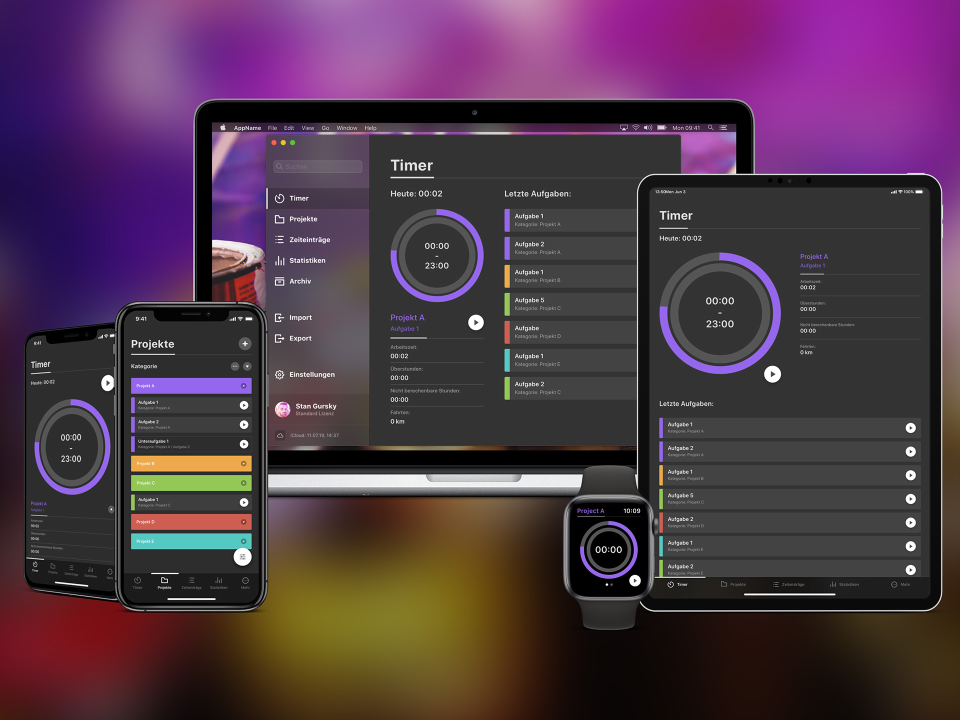
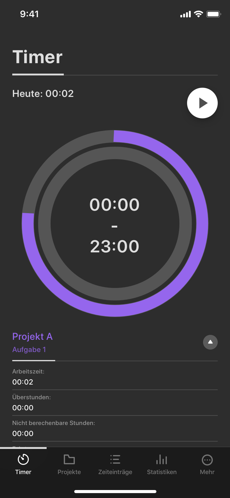
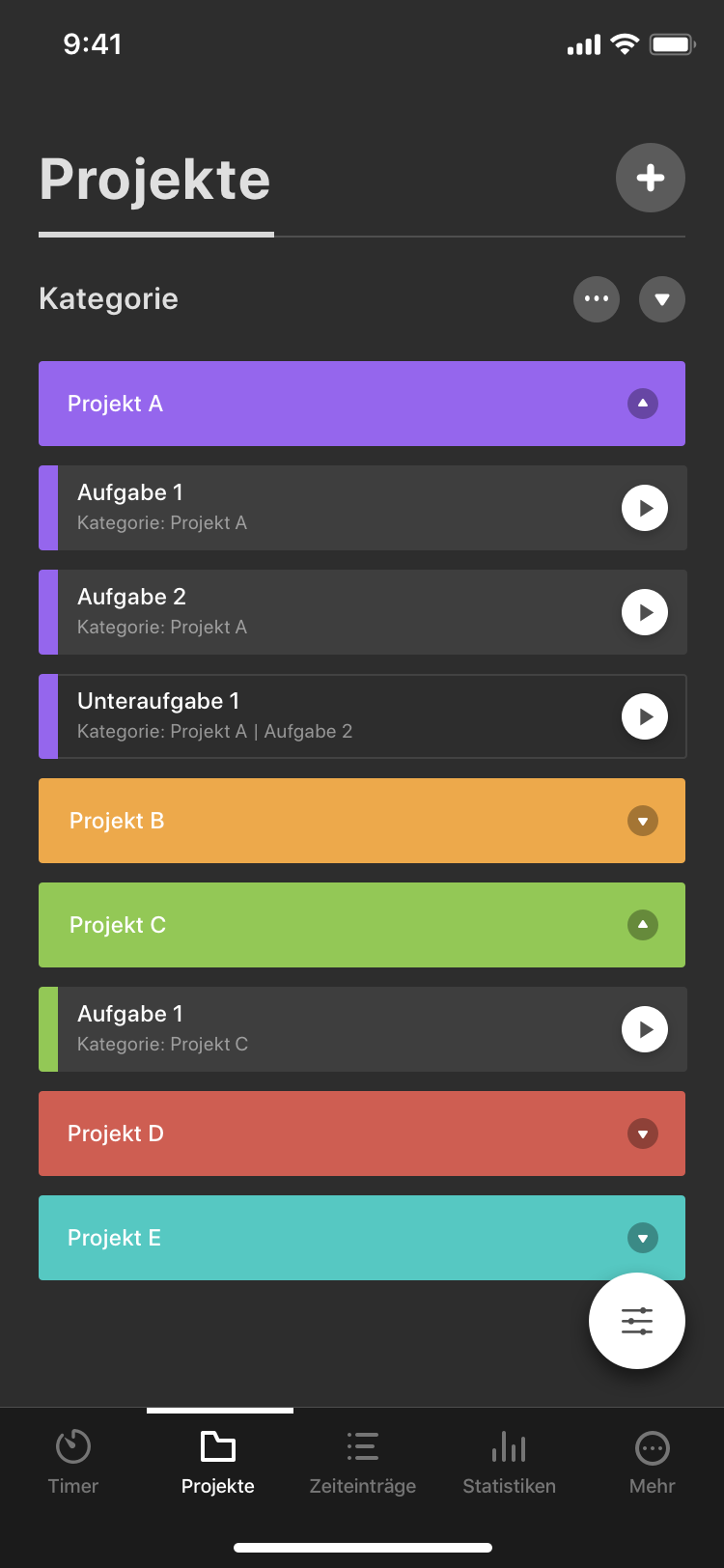
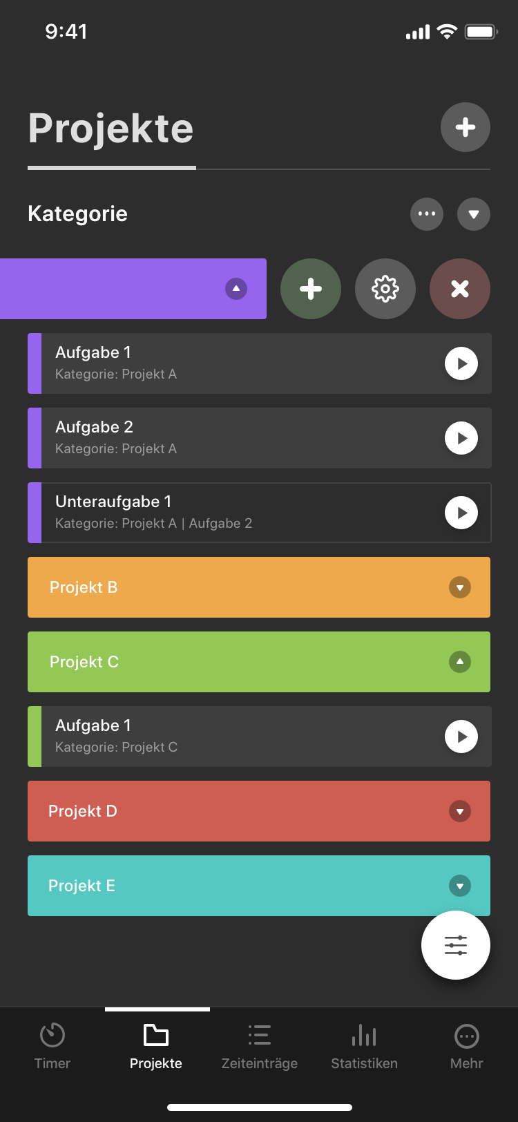
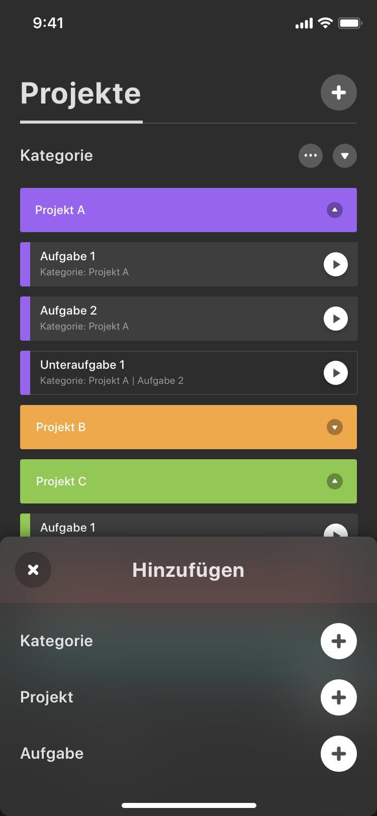
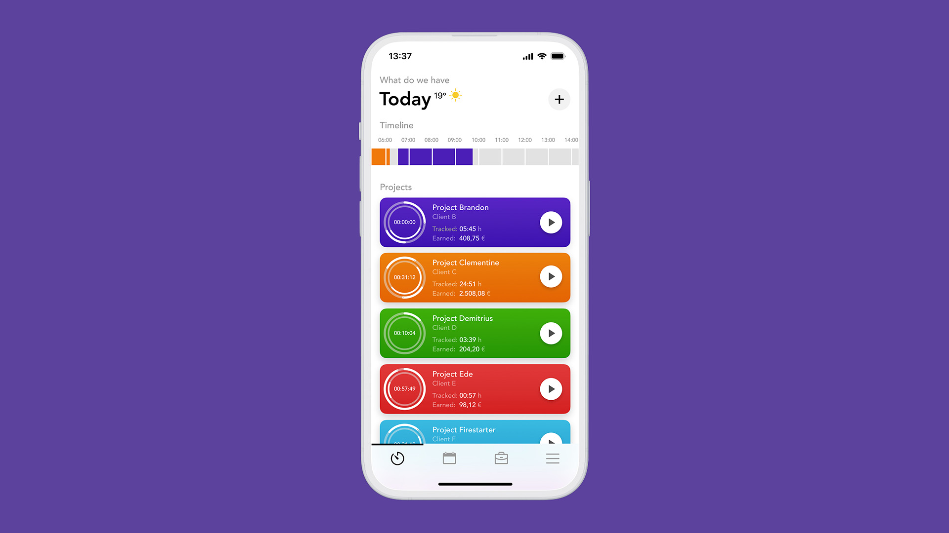
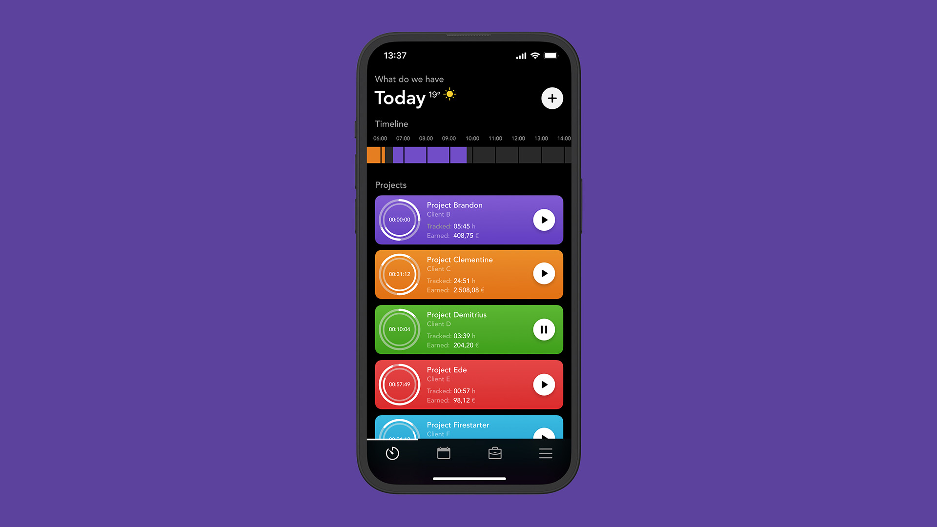
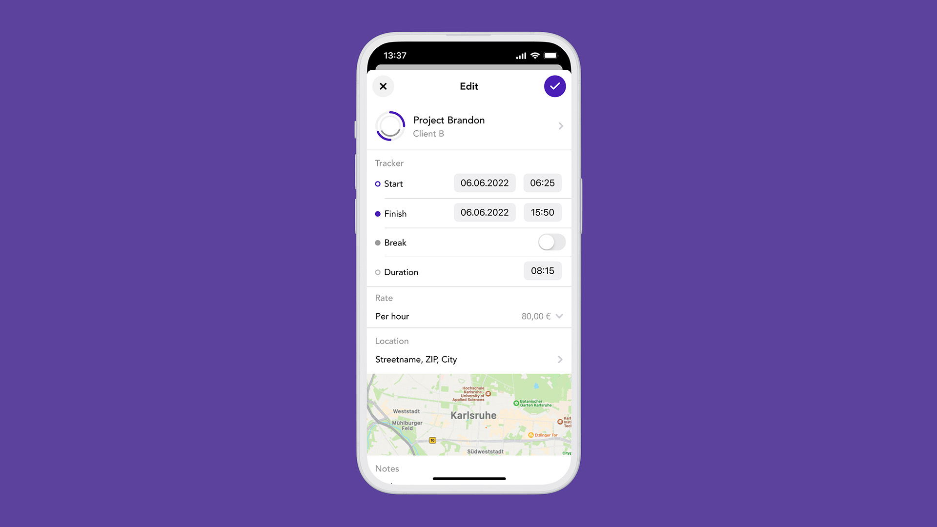
The primary and undeniably main function of a time tracking app is, unsurprisingly, to track time. Therefore, the main screen is dedicated solely to this purpose — a visually appealing and beautiful overview featuring color-coded projects with user-defined metrics, such as tracked time or earned money. To top it off (literally), there’s also an interactive timeline displayed at the top, showcasing color-coded entries from the tracked projects for an easy overview.
As I worked on TckTck, I decided to concentrate on only a few key screens, ensuring it wouldn’t consume too much time from my other real-world projects with paying clients. Speaking of mastering your time and acing your tasks (no pun intended), my focus was on the main time tracking screen, accompanied by a modal details view for editing a specific project. This details view includes various options, such as a more granular breakdown of tracked time, hourly rate, location, notes and more.
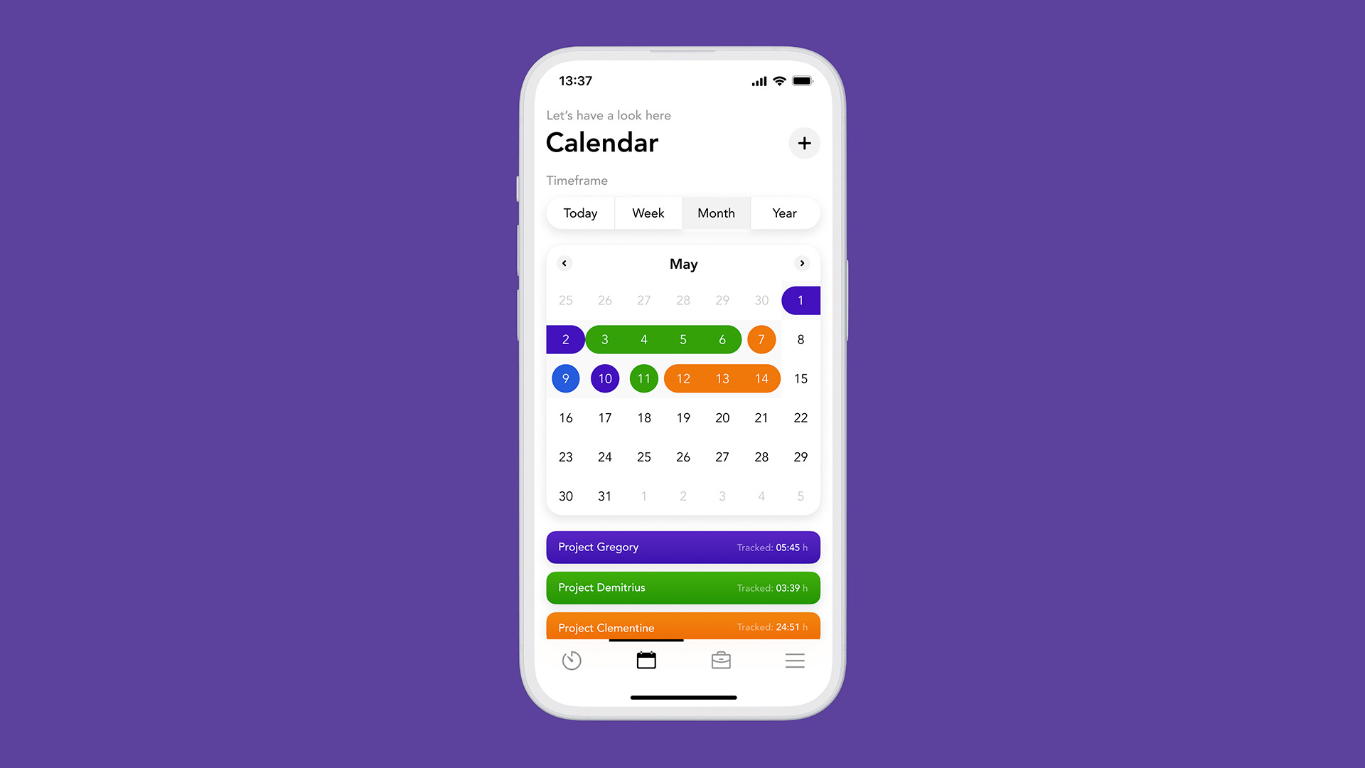
The other aspect I dedicated attention to was the calendar view, the second menu item, providing an enhanced overview of all projects (color-coded and tracked).


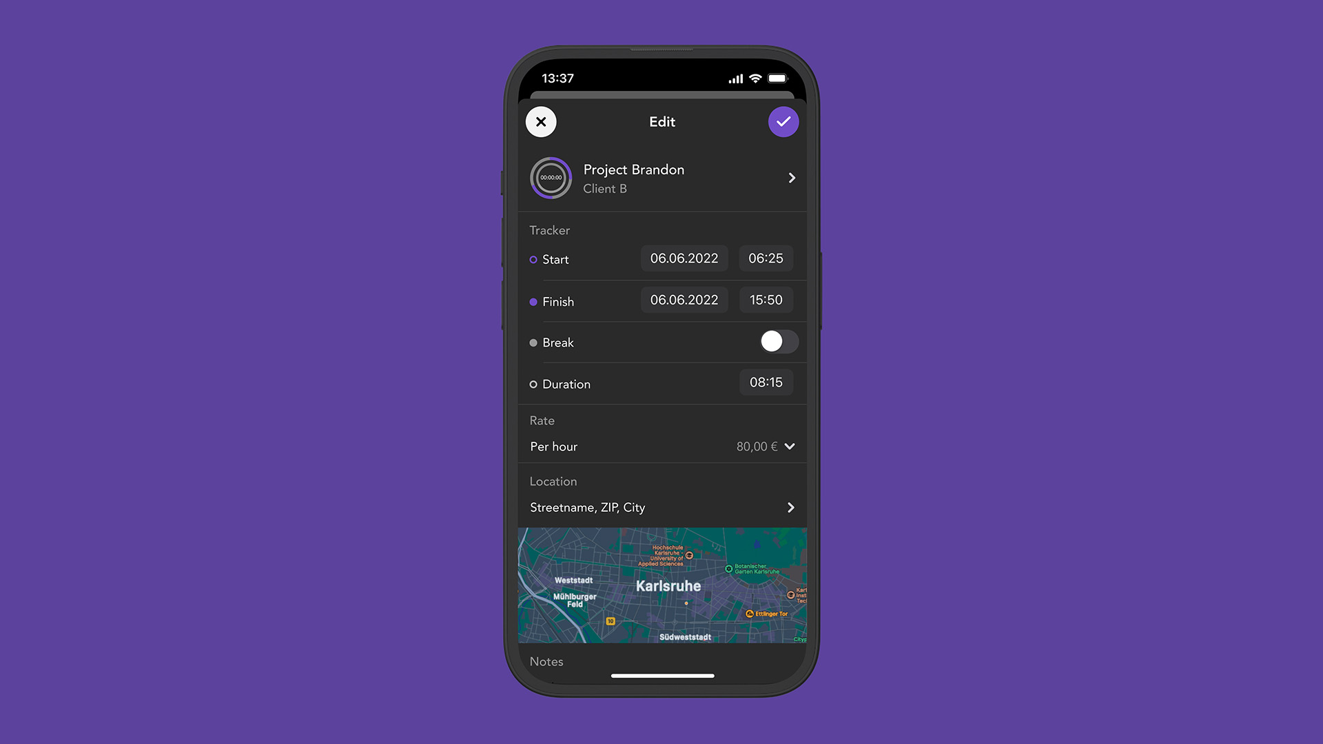
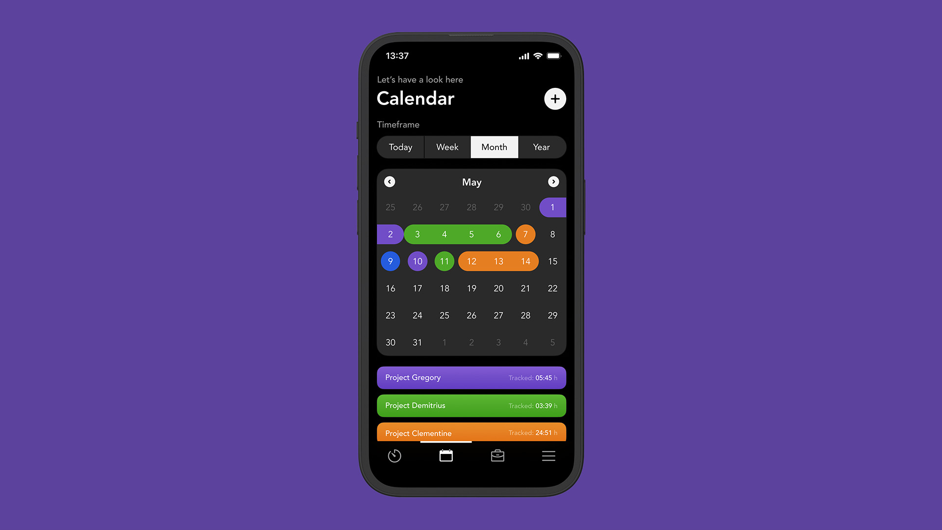
If I work for a client remotely and not onsite, I love working at night. Most of the best ideas come during these hours when there are no meetings, no need to run errands or clean up. It’s peaceful and quiet both inside and outside of the house, and only the sounds of nature are perceptible (especially when I have the windows open). It’s calming, soothing, and an amazing time to concentrate on a specific topic or project.
With only small and dimming lights on while working, a bright white phone screen can be pretty jarring and straining on the eyes. A perfect antidote for that is dark mode, which can also be a nice and elegant style overall during the daytime but, for me, it’s the better use case at night.
Over time, as my focus narrowed to a few key screens, I decided to take the whole time tracking app topic beyond just a fictional case study. I redirected my efforts towards enhancing and expanding an app I was already using and loving — Tyme (it was called Tyme 2 when I used it).
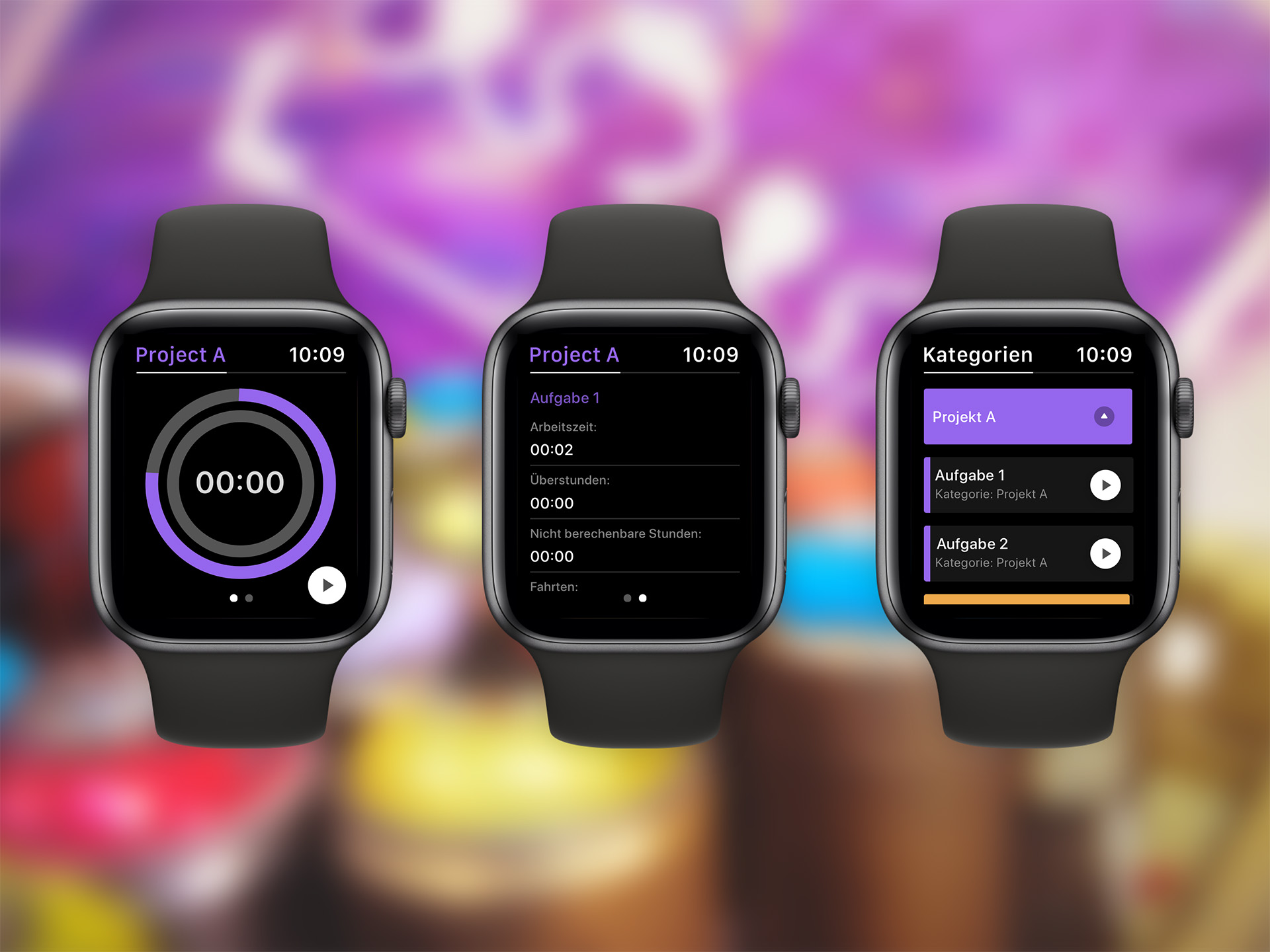
Wanting to make an impression on the app’s developer, I designed screens for phone, tablet, desktop, and even for the Apple Watch. Once my endeavor was complete, I sent the concepts to the developers to see if they were interested in a small collaboration. Unfortunately, the developer’s wife was already handling their UX/UI, and they didn’t require a second designer for the app. Nevertheless, it felt good to hear that they liked the concepts and had already incorporated some of the proposed improvements into the works for the next version of Tyme (Tyme 3).
If you’d like to take a closer look at that case study, I’ve posted a more detailed overview of the project on my Dribbble account.