App Name
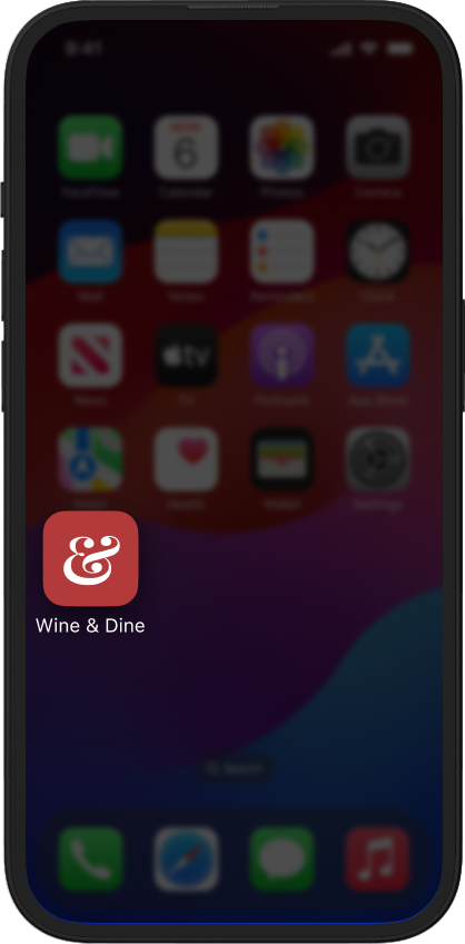
Wine & Dine
Wine & Dine
UX Design
UI Design
Interaction Design
Prototype
Animations
2019
iOS
Recently, I finally found the time to experiment with the relatively new tool ProtoPie. This tool allows me to enhance static designs with interactions and animations, offering a glimpse of what the final polished product could feel like.
ProtoPie is a powerful tool, as it can simulate a wide array of phone sensors, imitating real usage behaviors effectively.
So, in my pursuit of thorough testing, I needed a concept or interface to kickstart the process. (Un)fortunately, I didn’t have one ready, which led me to create a fictional shopping and browsing app for female underwear and accessories. After all, what better way to put such a prototype to the test?
To begin, my first task was to gather appealing images of women, which, surprisingly, wasn’t a bad endeavor. Additionally, I collected a handful of pictures featuring female underwear and accessories.
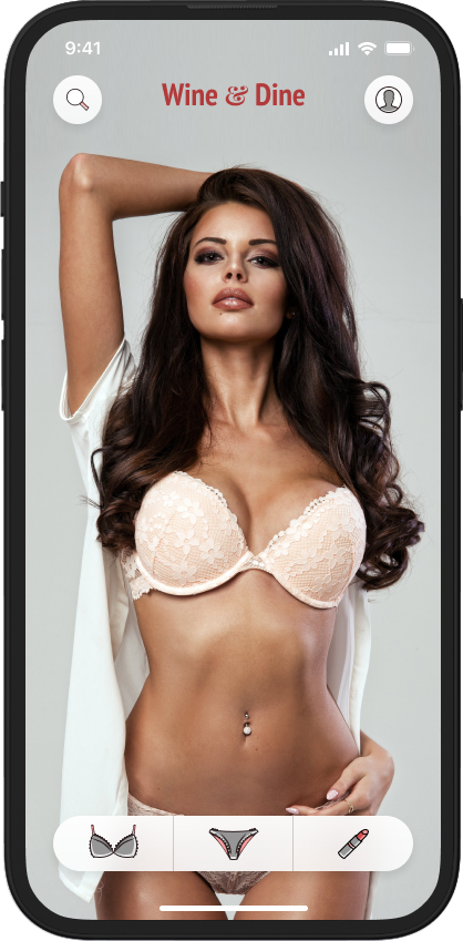
Once I had amassed my selection of visuals, I proceeded to craft a clean and minimalistic UI, commencing the prototyping phase. Simplicity was key in designing the user journey, ensuring that the interface remained uncluttered and free from unnecessary elements or objects.
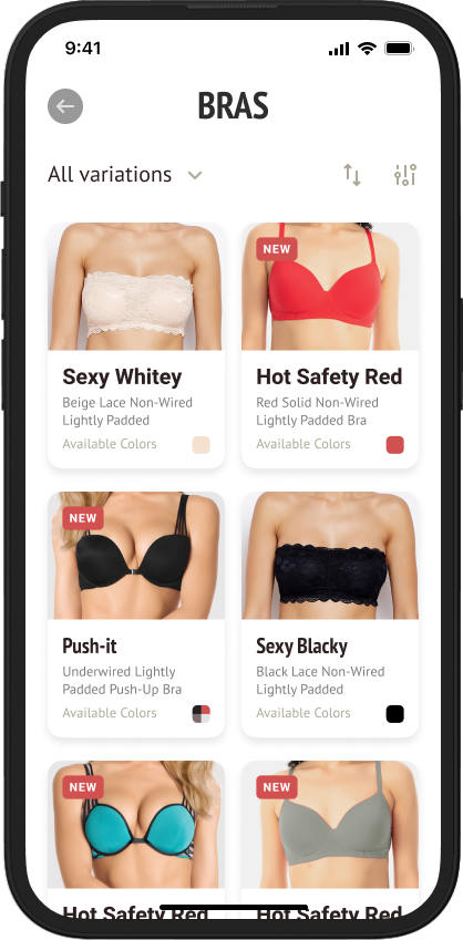
Clean and simple UI with beautiful high-qualities images and user-friendly navigation patterns.
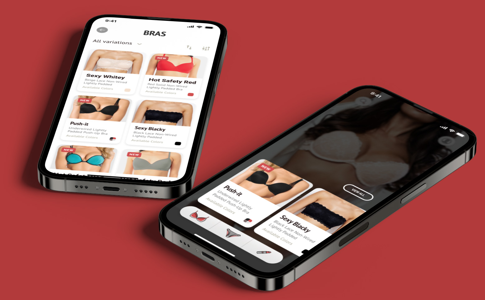
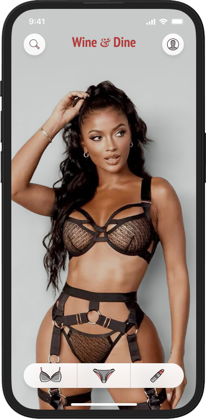
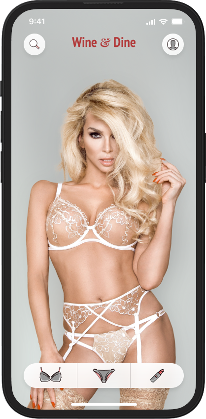
Navigating the app is a piece of cake, thanks to the main navigation options right at the bottom of the screen. You can’t miss it – it’s a slick floating Tab Bar with a cool pill-like shape.
Each tab on that Tab Bar has unique icons for different product categories.
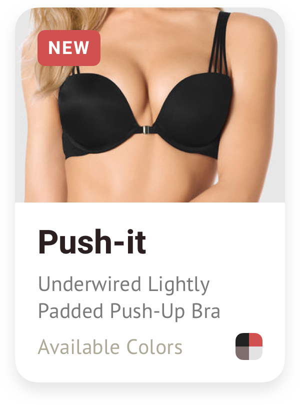
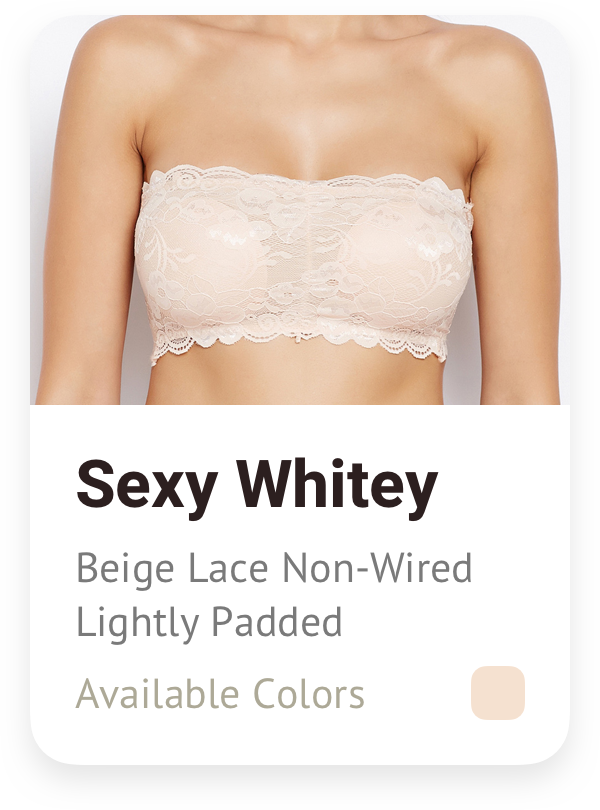
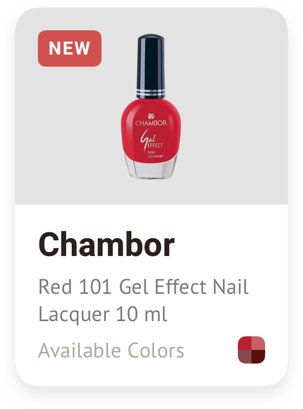
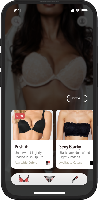
The products are showcased in neat cards, each with key details like the title, a short description, and the available color options. To spot the latest arrivals easily, I’ve added a small red badge to the top left corner of those products.
Ensuring that the visual identity remains unified and recognizable across different screens and contexts.
Aa Bb Cc Dd Ee Ff Gg Hh Ii Jj Kk Ll Mm Nn Oo Pp Qq Rr Ss Tt Uu Vv Ww Xx Yy Zz
Aa Bb Cc Dd Ee Ff Gg Hh Ii Jj Kk Ll Mm Nn Oo Pp Qq Rr Ss Tt Uu Vv Ww Xx Yy Zz
I aimed to streamline the navigation to its simplest form (I understand that such an approach might not be practical for an actual product, but it’s enjoyable to experiment with such concepts).
For the background, a unique feature involves zooming in on different parts of the model’s body as each associated category is tapped. For instance, when a user selects the bras section, the background focuses on the breasts, creating an engaging interaction.
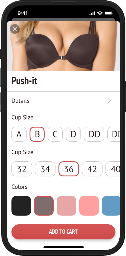
Similarly, the product details modals maintain a consistent approach. A captivating image sits at the top, with an array of options and settings displayed below it, ensuring a comprehensive view of each item.
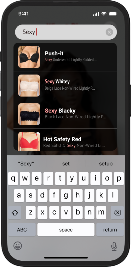
Simply tap the “Search” button and begin typing your keyword. As you type, the autosuggest feature leaps into action, promptly displaying relevant products that match your query.
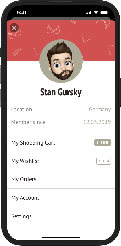
Tap the button located in the upper right corner to access your profile. Within your profile, you’ll find your shopping cart, wishlist, settings, and all the standard entries you’d typically anticipate.