Client
Nero AG
Nero AG
Concept
Icon Design
Illustration
Composing
Product Consulting
2014
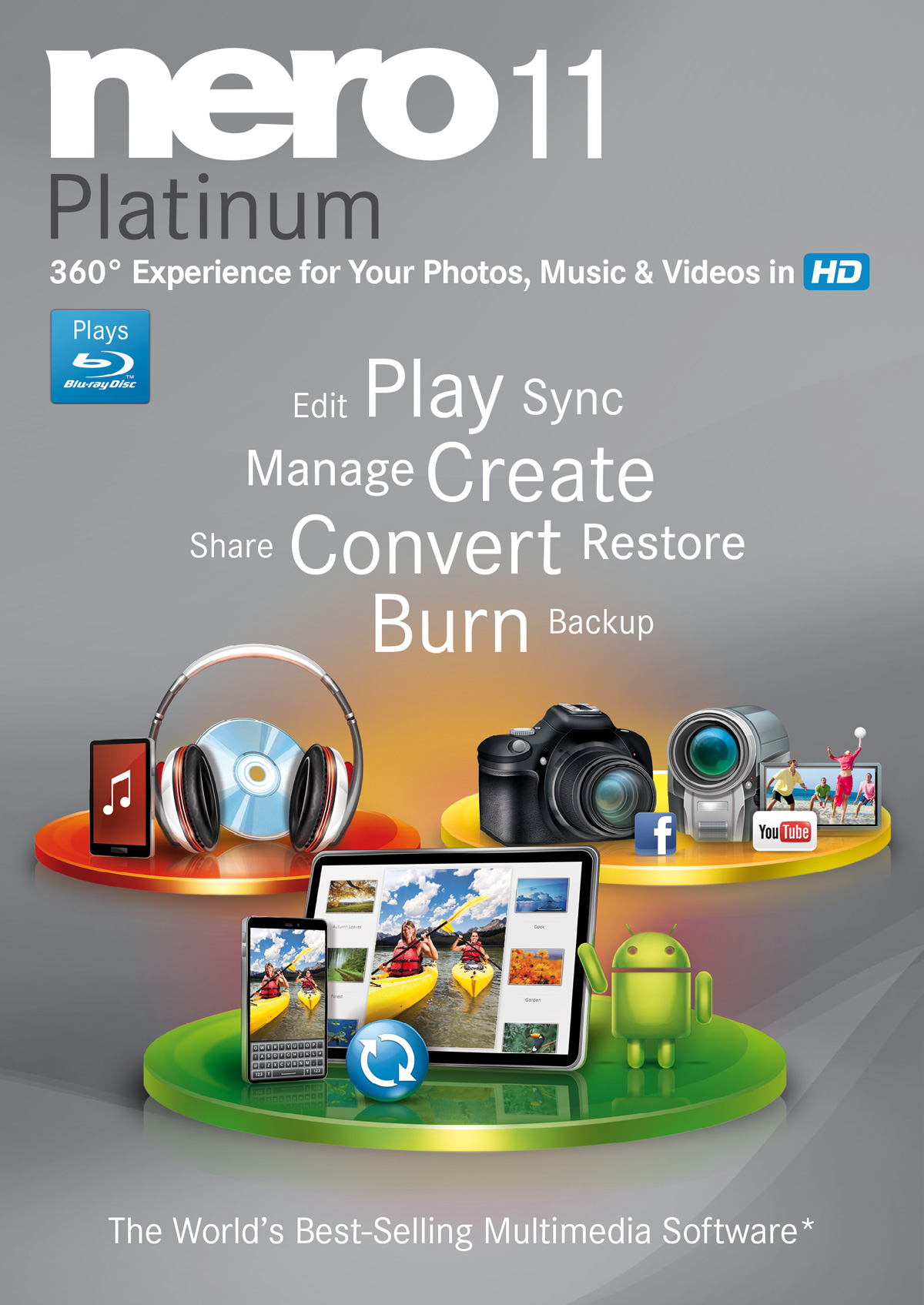
During my brief tenure at Art Crash, one of the exciting projects I undertook was conceptualizing new cover art for Nero 11, encompassing both the regular and platinum editions. It was a remarkable experience for me, considering my familiarity with Nero since childhood, and the fact that my illustrations would eventually grace its packaging.
Throughout the process, an internal pitch played a pivotal role, resulting in the selection of my designs after I explored numerous iterations.
The project entailed specific prerequisites, including the incorporation of select colors from previous editions and integrating visual elements to accentuate the innovative features of the new software. Consequently, the regular and platinum editions featured distinct sets of gadgets and elements tailored to each cover.
At the heart of the effort are the front covers, intended to be attention-grabbing and captivating. Here’s a closer look at the front design.

While developing the initial layout, a significant part of the process involved creating a multitude of gadgets and icons, some of which went unused or underwent modifications. Numerous gadgets were crafted in diverse perspectives, colors, and lighting schemes. Hence, presented here are several illustrations intended for the Nero 11 regular edition, which unfortunately did not make it into the final version.
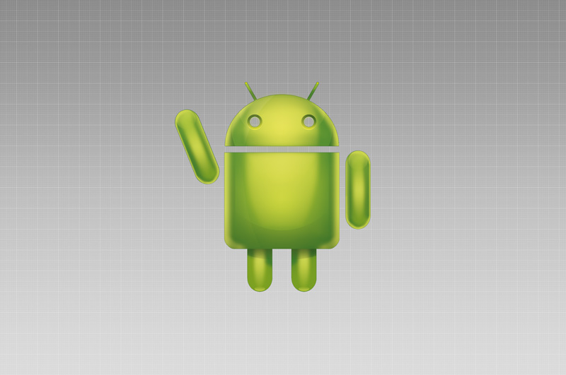
Below, you’ll find a selection of illustrations I crafted for the Nero 11 Platinum Edition, alongside a few that didn’t make it into the final release. I must admit, that DSLR camera proved to be quite a challenge and a pain in the ass to bring to life—what with all those intricate rings, knobs, and other intricate details to painstakingly depict.
A selection of icons that were employed in designing the cover illustrations.