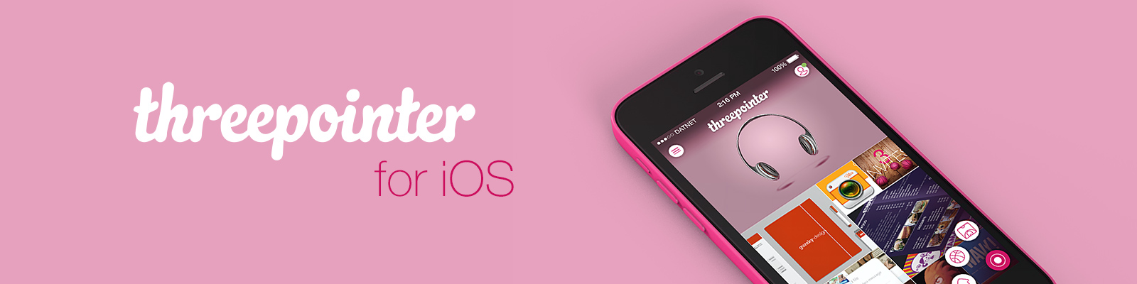
App name
Threepointer for iOS
Threepointer for iOS
UI, UX, Concept
Apple iOS
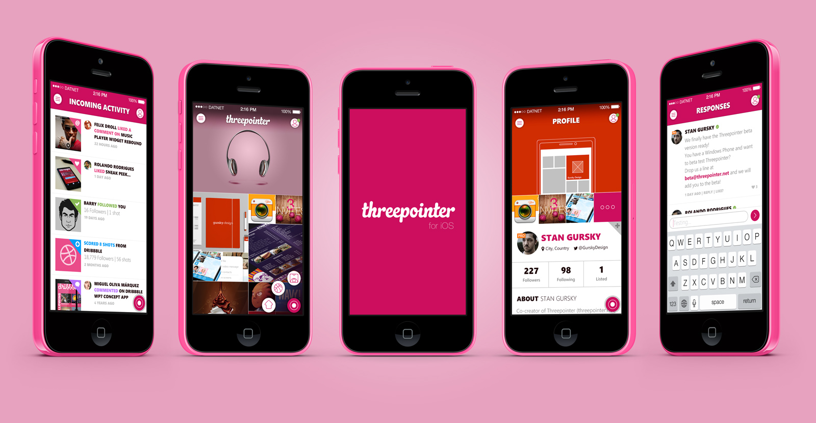
I thought it would be cool to see what Threepointer (unofficial Dribbble app for Windows Phone) might look like on an iPhone.
So I made a little case study for iOS with 3 different styles.
The Windows Phone Metro/Modern/Whatever UI got adopted to the flat iOS style.
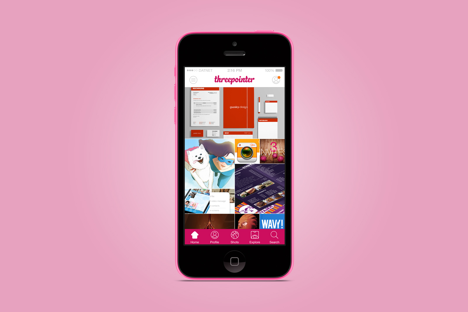
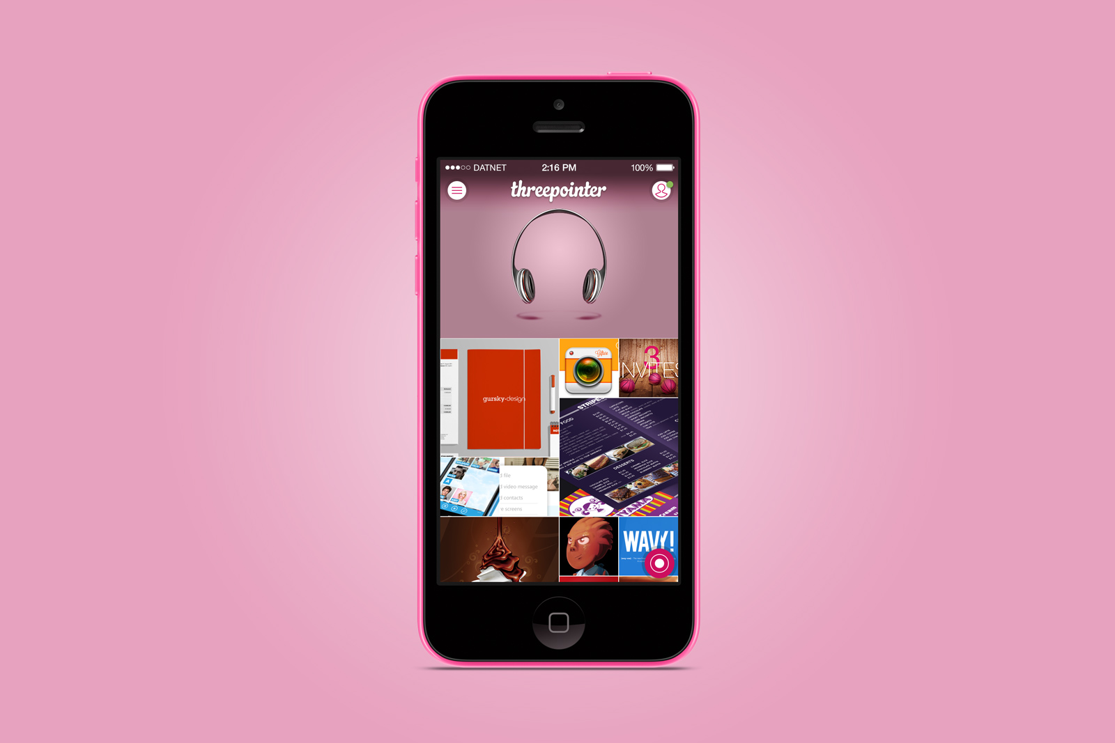
This is the first (pretty traditional) design with adopted colors and layout from the Windows Phone version, except that scrolling Threepointer now works vertically and not horizontally.
You also get the regular tab bar with custom icons.
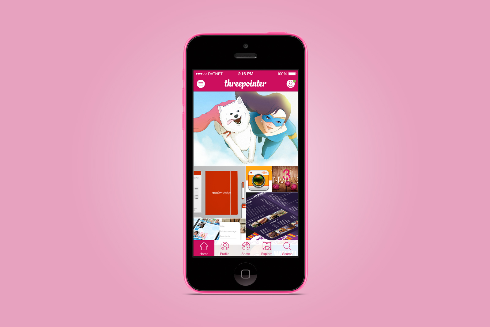
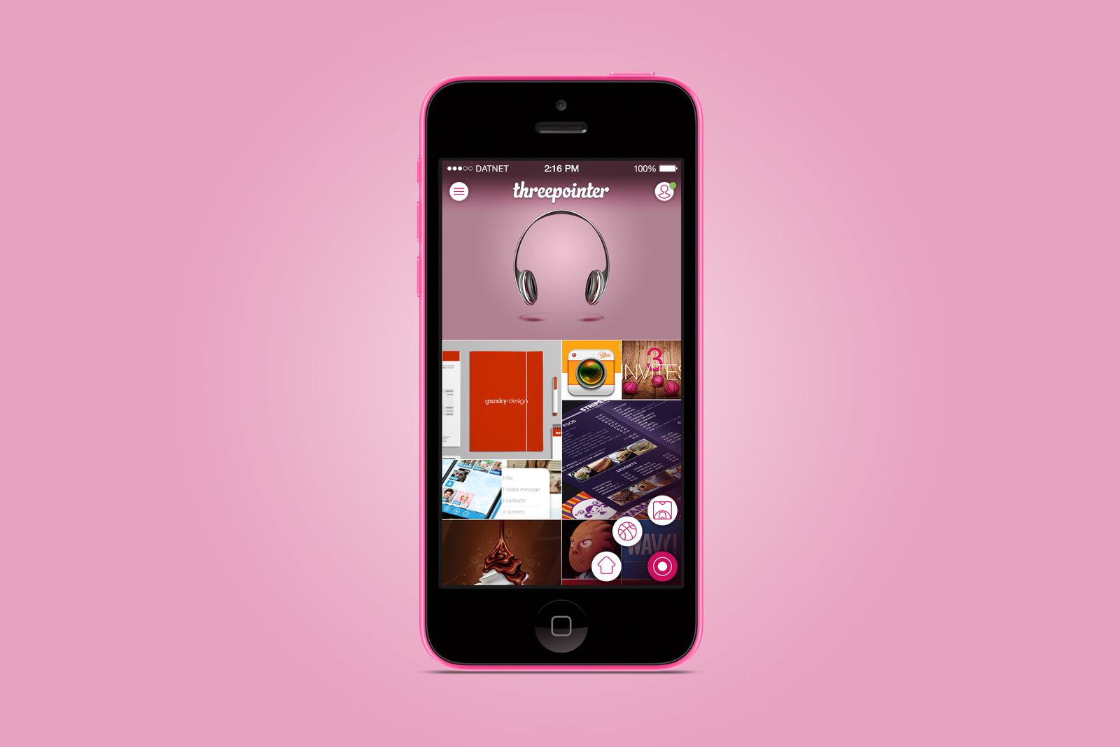
This is the second version for Threepointer and what it might look like on an iPhone.
This time I switched up some colors around to see if it works better that way opposed to the first version.
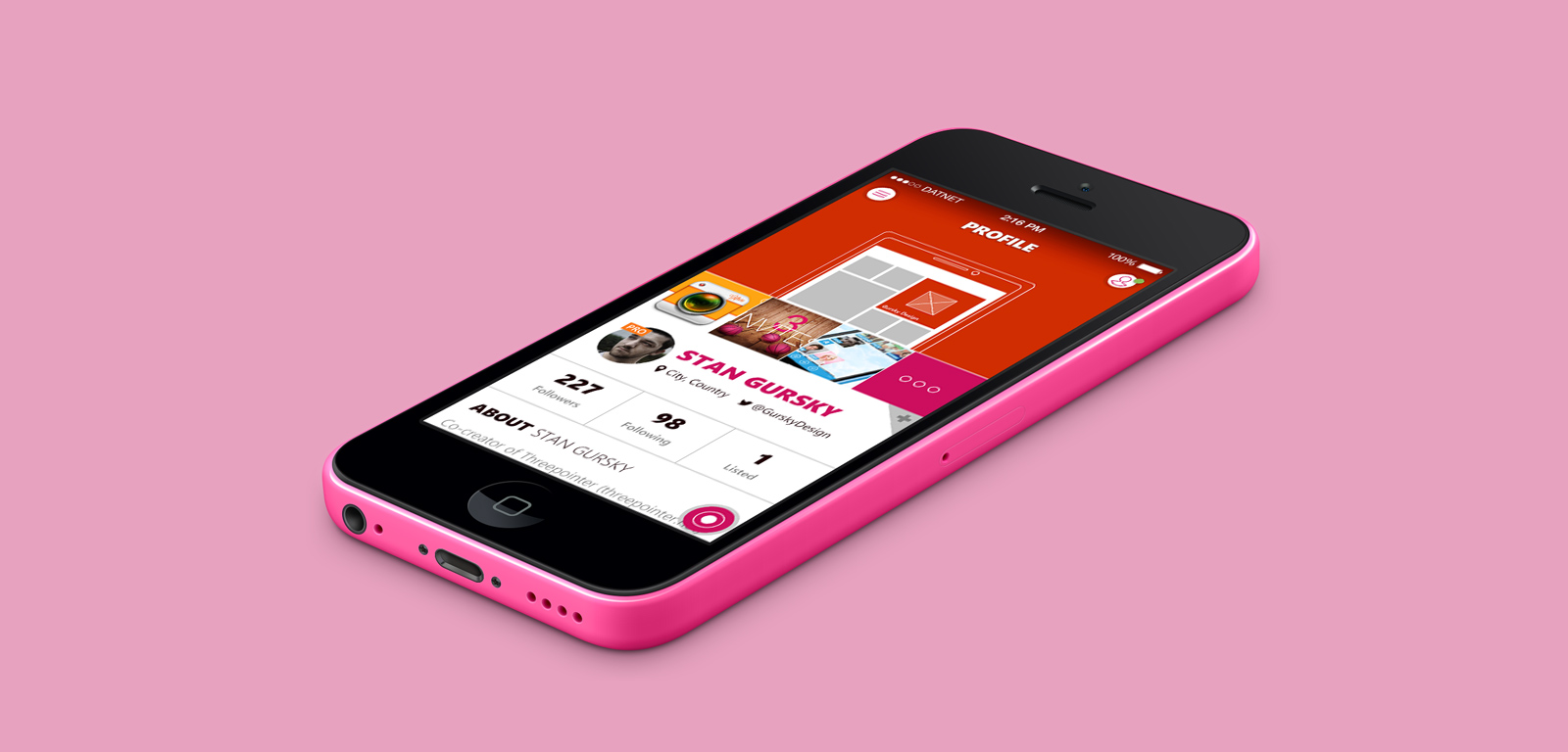
This is the third version for Threepointer and what it might look like on an iPhone.
In this version I tried to get rid of all the unnecessary elements such as buttons and backgrounds, so the focus is only on the content itself.
Instead of having the regular tab bar at the bottom, I put a floating menu button in a corner. If you’re right-handed, then the button would be on the right side and vice versa for the left-handed folks.
A tap brings up three main navigation buttons for a quick switch between the screens.
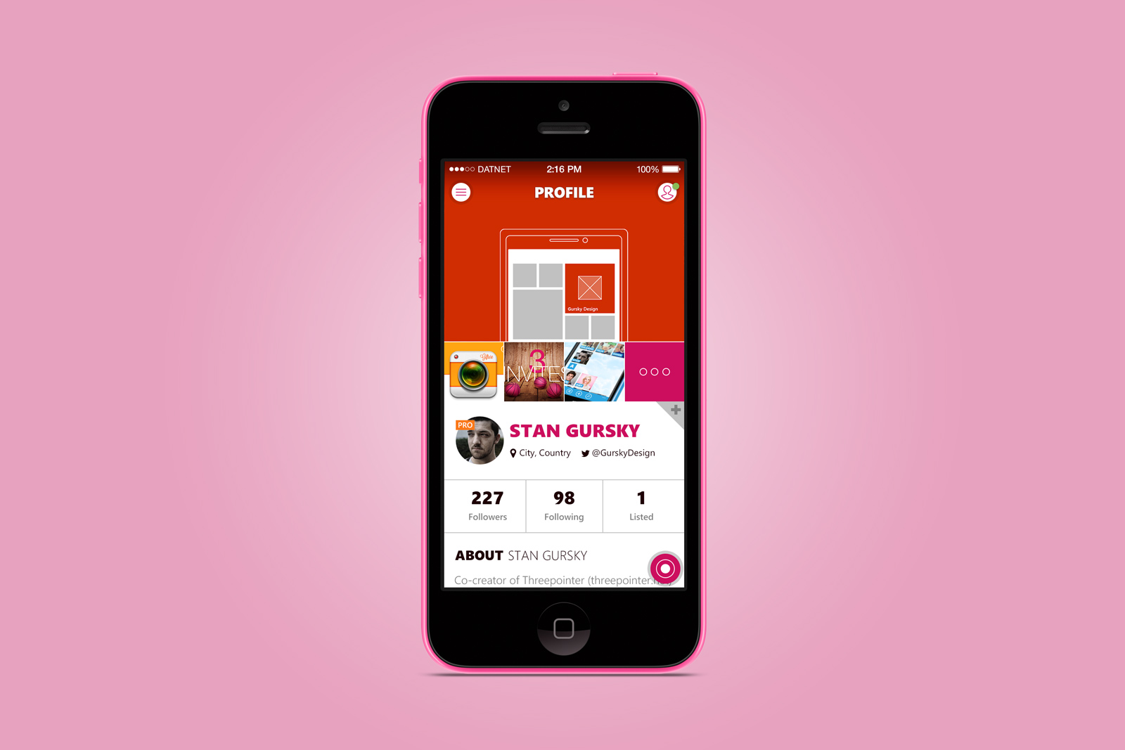
On the profile page I wanted to simplify the entire layout. I got rid of the pivot navigation from the Windows Phone version and combined the sections on one page.
So now you have a players’ last 4 shots at the top with a button to the shots and projects page. The same goes for the likes, which are now at the bottom of the profiles screen.
Threepointer for iOS is not in development as of now. But who knows what the future holds and how things will work out 🙂