App Name
Telegram
Telegram
UX Design
UI Design
Interaction Design
Concept/Case Study
2015
Windows Phone
Earlier this year, when Facebook acquired WhatsApp for a measly 16 billion dollars, it caused quite an uproar. Many individuals were anxious about the fate of their data, particularly given the existing trust issues with Facebook. Consequently, a considerable number of users either began or contemplated migrating from WhatsApp to alternative messaging platforms like Telegram and Threema.
Since Telegram is open-source and the existing apps for it on Windows Phone were essentially identical in terms of functionality and appearance, we embarked on the development of a Windows Phone client for Telegram. However, we ultimately shelved the project because Telegram did not gain as much popularity as we had hoped. Nevertheless, we are excited to share our design concepts with you!
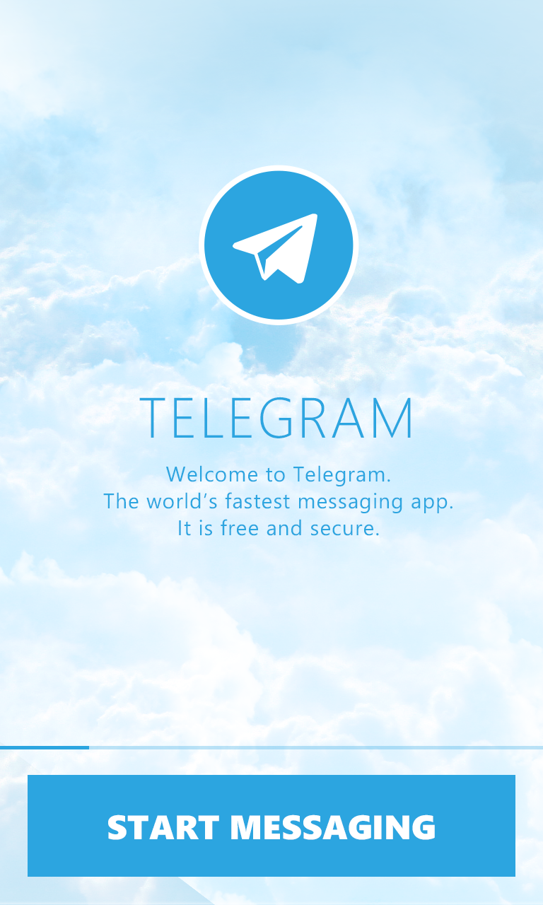
We aimed to choose a name for our app that bore a resemblance to Telegram, leading us to the name “Lettergram.” Our fundamental concept was to create a messaging application that not only exhibited a visually appealing and user-friendly interface but also delivered swift performance, given the frequent use it would receive. After careful consideration, we decided on a light blue cloud and sky-themed design, which complements the Telegram paper plane icon quite nicely.
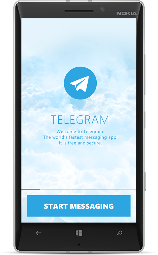
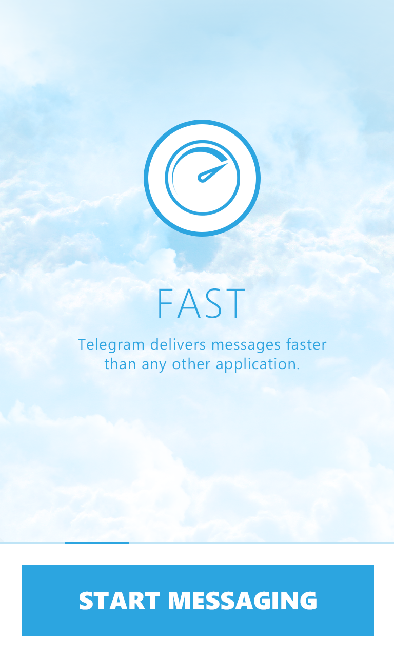
Upon your initial launch of Lettergram, you will receive step-by-step guidance through its fundamental features and the process of configuring the client with your phone number in a brief tutorial. You can either swipe through the tutorial or proceed directly to the setup – the choice is yours.
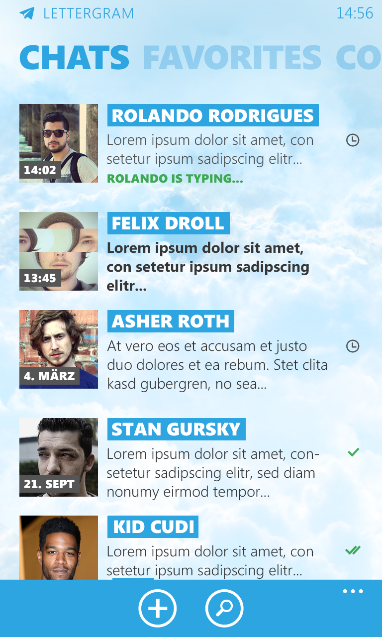
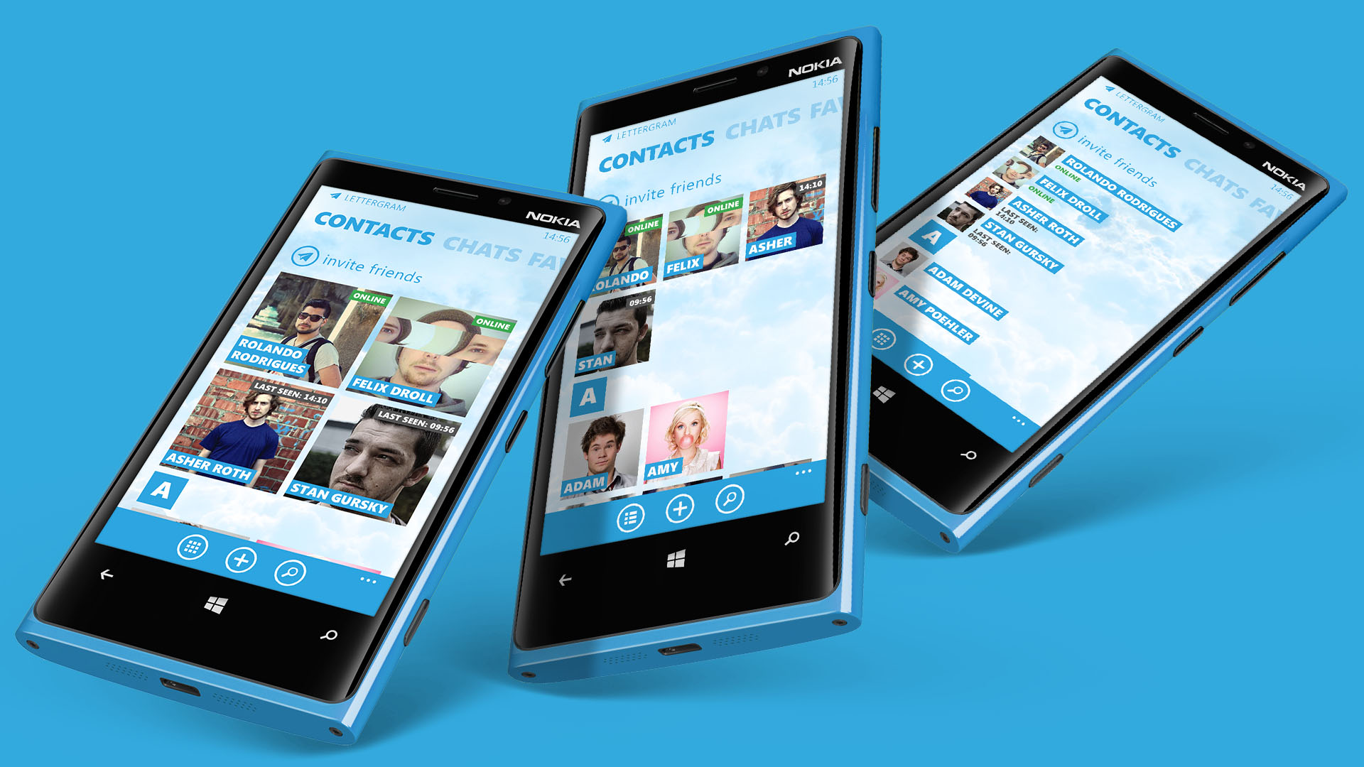
The contacts screen provides users with the flexibility to switch between various display options for their contacts. There are three distinct views available: A 2×2 grid featuring large contact images and accompanying status information. A 3×3 grid with smaller contact images. A Listview format that includes contact thumbnails along with status information.
Each contact thumbnail could also refresh itself with updated information, such as when a user starts typing a message or changes their profile picture.
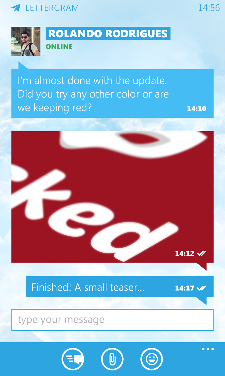
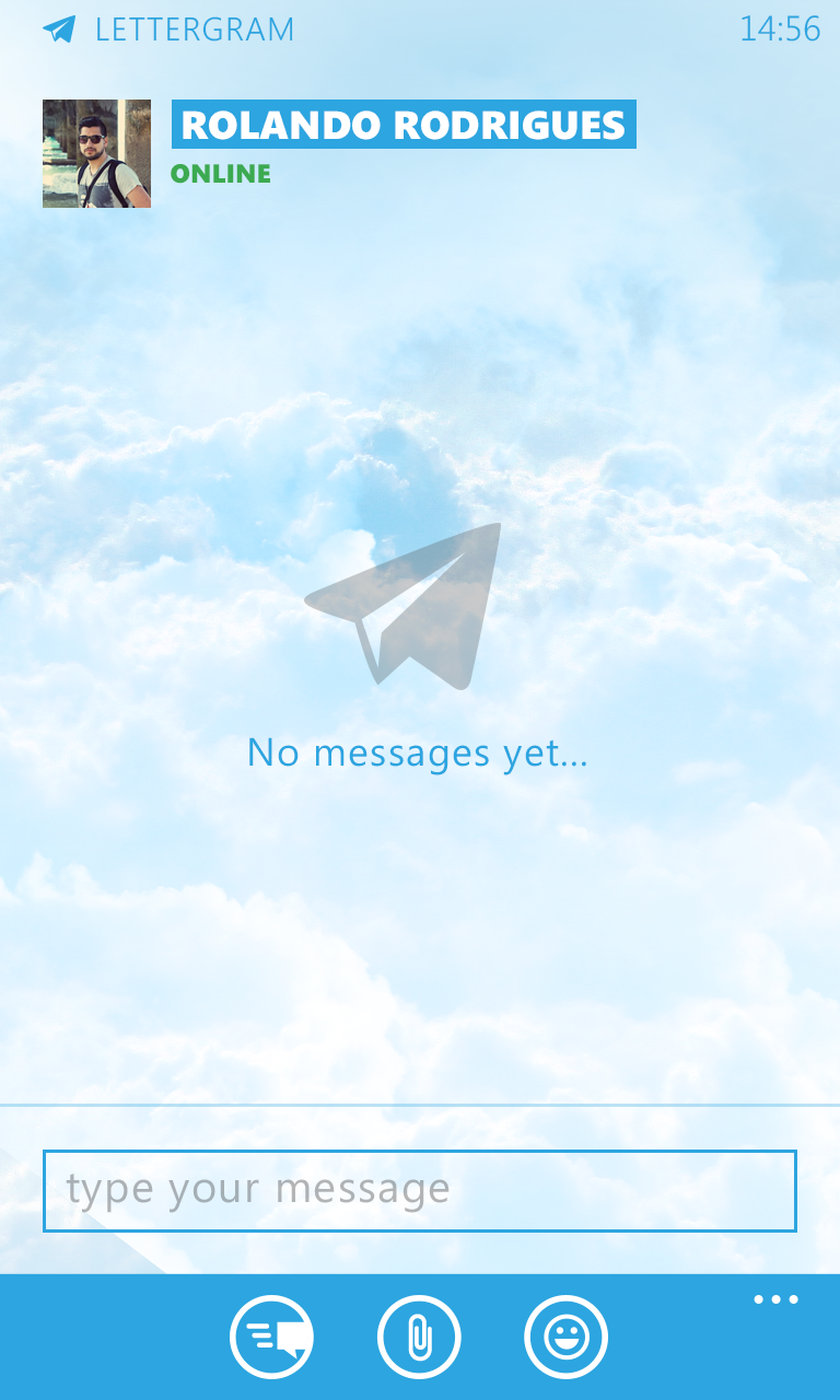
Engaging in conversation doesn’t need to appear dull. Rather than opting for a monotonous black background, we’ve chosen to embrace the sky and clouds theme, elevating the entire messaging experience. Additionally, users have the option to select from pre-set backgrounds or even use any image from their Windows Phone. You’ll also have access to the usual emoticons, emojis, and the ability to include inline images and videos directly in your messages.
A clean and modern approach. No borders, no shadows, no unnecessary chrome.